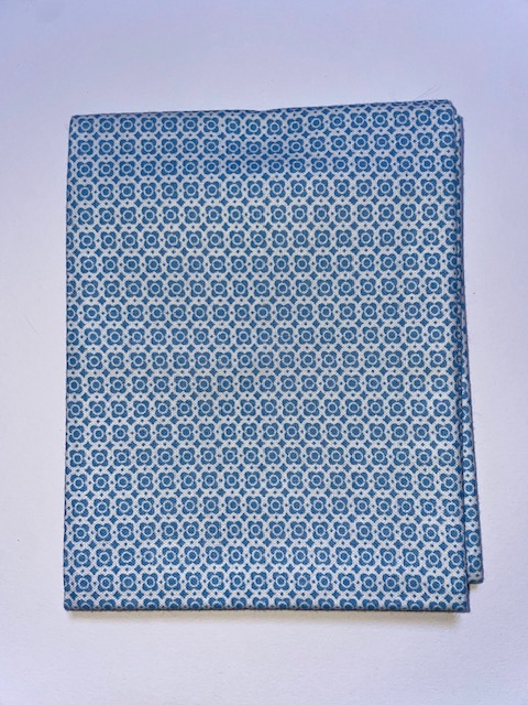
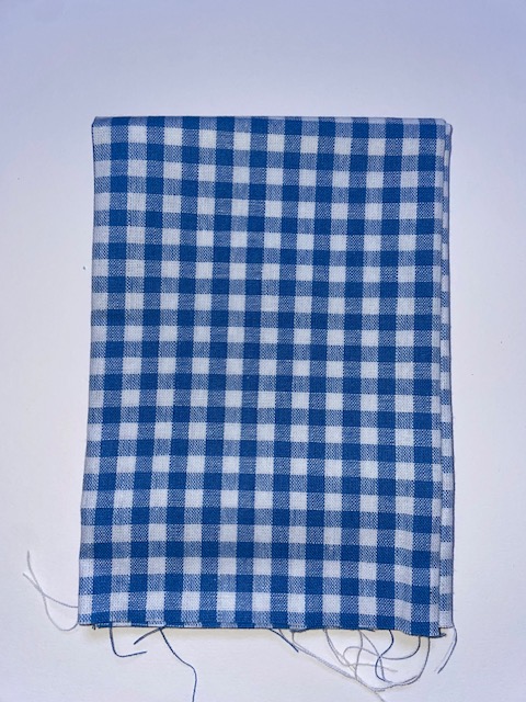
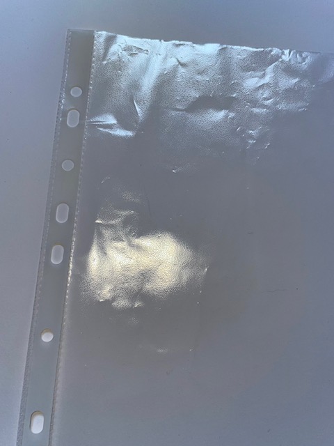
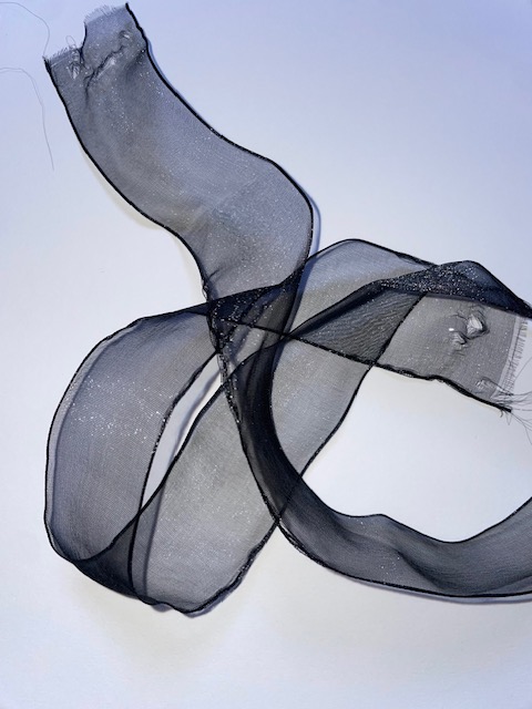
In this exercise, I had to look at the coloured stripe design relating to the transparent still-life I created. I then had to develop ideas and apply methods of deconstruction and reconstruct them into yarn concepts. With these colour palette in mind, I gathered some materials that reflect these colours that I could manipulate and take apart in some way. I found some coloured fabric, ribbon and string. I also had the idea of using a plastic wallet for the yarn concepts as it is transparent.
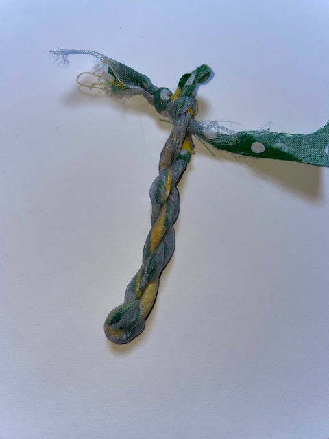
The ribbons I found was semi-transparent so I thought that would be good to represent the colour palette. I used this transparent ribbon cut in half and a strip of green and yellow fabric. All of these frayed after cutting them. I used the rope-making technique and twisted them all together. I tried to make the ribbon go around the fabric to make the colours dull and it did exactly what I wanted it to do.
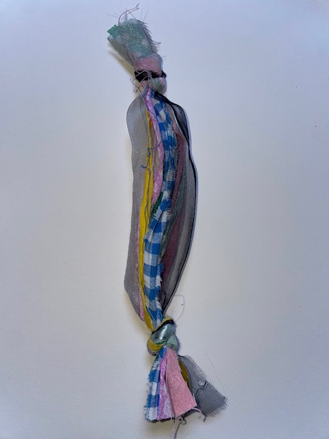
The next one I made was using the different coloured fabrics again with some ribbon that translated the blue tones in the palette. I used the plaiting technique and tied 6 different strips of fabric and ribbon together.
I tore more strips of fabric up but some different colours this time to explore a different palette. Using a black semi-transparent ribbon, I wrapped this around the strips of coloured fabric and just tied the two ends together so it almost looks like the colour palette strip design.
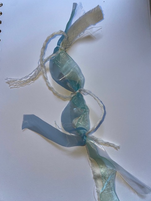
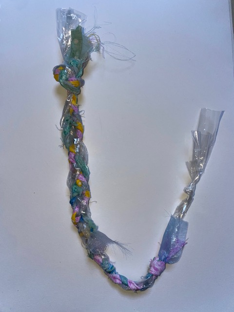
I wanted to experiment a bit more so I cut up some strips of the plastic wallet and pulled some string apart to single strands. I used two shades of semi-transparent blue ribbon with the plastic wallet strip and laid them next to each other. With the string I tied knots in three places going down the design. You can’t really see the plastic wallet in the final design and it didn’t seem to make anything change colour but it was good to have it to reflect the glass in the colour palette.
The final yarn design I made was another plait but this time using a strip of the plastic wallet. I tore bits of coloured fabric up and cut some ribbon to make it fray and then made a plait with all these pieces. Some of the ribbon wasn’t long enough to go all the way down so towards the bottom it became fewer colours. It was a pleasant turnout to see the colours fade away.
Again, I enjoyed this exercise as I stepped out of my comfort zone and used materials that I wouldn’t ever use like the plastic wallet.
The aim of this exercise was to employ colour and mood translation in materials and yarn sourcing. I had to explore, reinvent and reinterpret an approach to building structures and research any unknown techniques. Referring directly back to the work I created in Exercise 3.2, I’ll use this as an inspiration to create a series of yarn designs. In 3.2, I selected an image of an Old Masters painting and created a series of yarn wraps from that. I was asked to keep a note of what materials I used in that process to be able to come back to it in the future. Luckily, I had kept all of the materials used in that exercise. I decided create a yarn design for each of the yarn wraps I made.
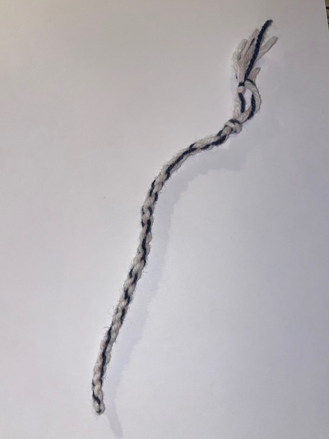
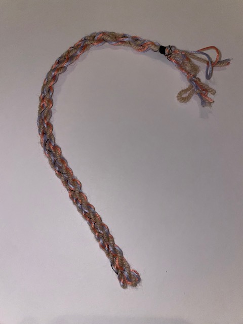
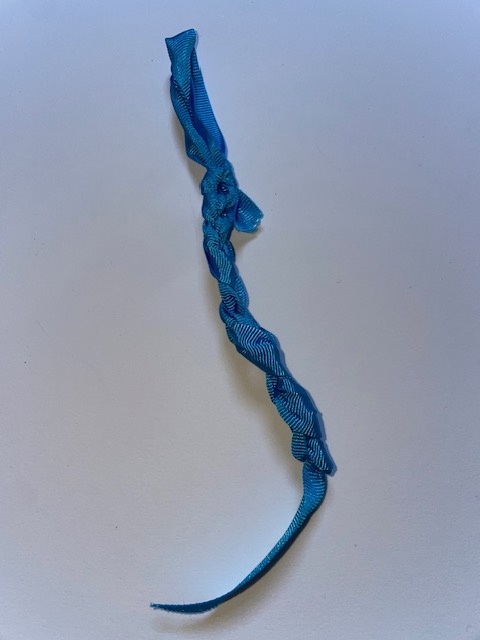
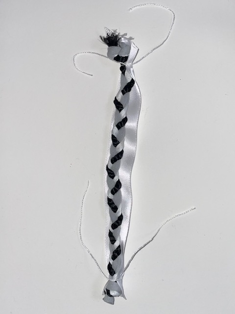
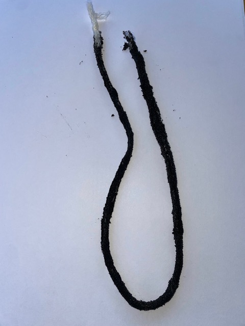
I had to research a few techniques to apply to my own practice. The first one I looked at was rope-making. I didn’t have to do too much research on this one because my Nan taught me how to do this. I used 2 pieces of yarn of my choice and tie the ends together both sides. Then, separating one from the two, I just twisted it around my finger until it became tight. I tied the two ends together and pulled it straight and it created this rope. I did a practice test first with yarn and again with ribbon. Then I use the colours from the yarn wrap to create the actual design. I enjoyed making this one because it is simple yet effective. To ‘reinvent’ this technique, I made another yarn and using a black thread, I stitched them together to create a thicker wider rope.
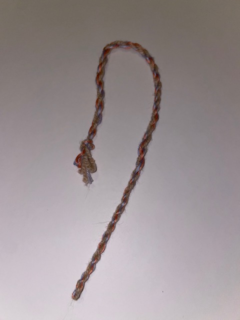
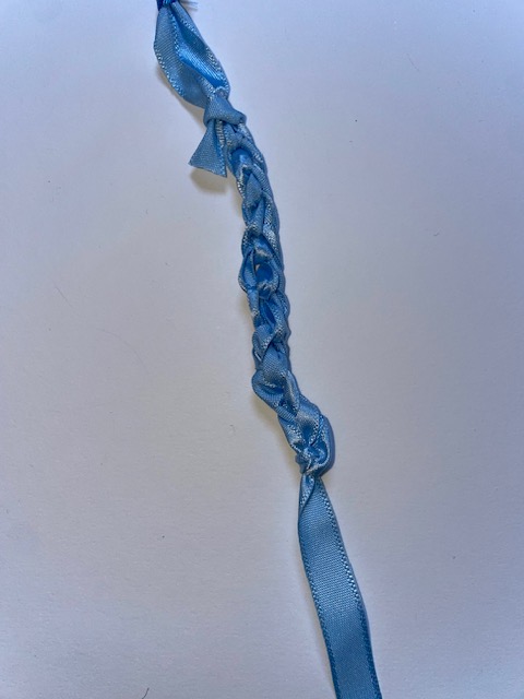
The next technique I tried was braiding. I learned from the research of braiding that it is essentially a plait but you add sections to it as you go along. I used light and dark blue ribbon with yarn and started plaiting them. I then added a pink ribbon into the plait to form a braid. It was a little difficult to add the pink ribbon in without it falling apart but I managed to do it and the outcome was effective.
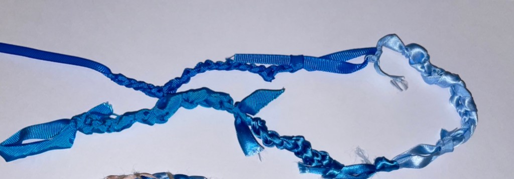
I then tried macramé which is another technique that my Nan showed me. You start by making a loop and then keep making loops but tightening them to create a chain. I did a practice run with yarn to see if I could do it and then used the selected materials. I made four chains and used the same colours and materials from my yarn wraps. I tied all 4 together to create one long one.
Reflection
I enjoyed this exercise because it allowed me to explore more techniques and learn new things. The rope-making was the most successful in my opinion and I will use this in the future however I learnt that ribbon isn’t a great material to use to create it. Simple yarns or string should be used for it to be the most effective. Looking at the finished yarn design, I feel I reinterpreted it in my own way but compared to the Old Masters image, I could have used different colours that are more prominent in the image.
The macramé turned out well but it wasn’t the most successful and I think I could have done a proper one using yarn if I had more time to make one. There are so many YouTube videos to watch and learn step by step but it is time consuming. The braiding technique was successful although a little difficult at first. I didn’t need to research it as I knew what it was but had never had a go before. I felt like I could have improved it by experimenting a bit more than I did and including more colours from the Old Masters painting.
Overall, I enjoyed this exercise as there was a few things that I could take away and use in future projects. Especially the rope-making. I had tried to create something like this in previous exercises by twisting them together but they always came undone until my Nan told me I need to tie the ends together.
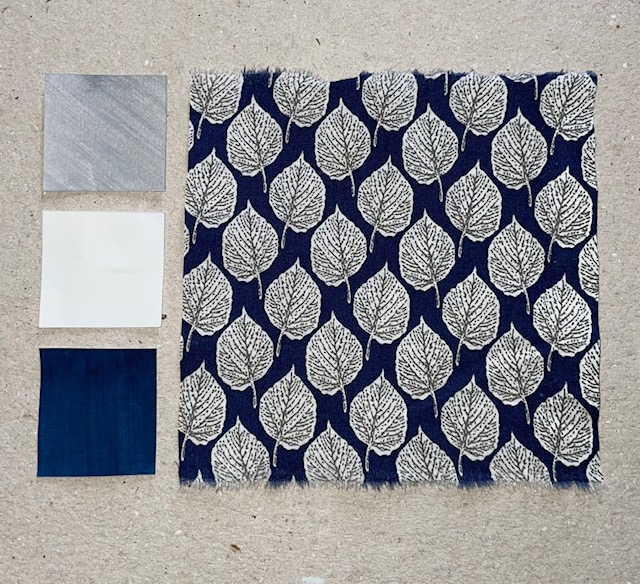
The aim of this exercise was to help me explore colour translation in yarn design and explore textures with unexpected materials. Looking at the work I created in Part Three, I made some a range of colour chips in Exercise 3.1. Referring directly to this as well as the original textile sample sourced to create the colour chips, I made a series of yarn designs.
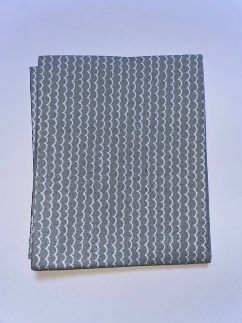
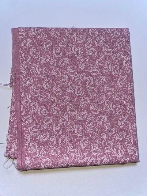
Starting with selecting one of my full colour palettes from 3.1. I chose to work from the bright and bold paisley print because it inspired me the most. I then had to gather some yarns, threads and ribbons as well as wire, feather and beads in order to create linear concepts that reflect the colours on the sample. There was three categories of yarn concepts that I had to explore and create:
Colour Placement and Composition
Materials Exploration
Texture and Tonal Qualities
Colour Placement and Composition
This task was to translate the colour proportions from the printed textile into a yarn design. I chose to look at different sections of the sample when creating these yarns to include a variety of colours. I started with red ribbon and purple pipe cleaners. I wrapped the pipe cleaner around the red ribbon equal distance apart to create little balls and then I added thin black thread around each ball. I love the outcome of this one because it translate the colour and proportion of colour perfectly for the section of sample I was looking at.
The next yarn I created focused on a different section of the sample. Using a dark green ribbon as the base yarn, I cut small pieces of red and orange to tie onto the green and then twist it around. Again, I am happy that it translate colour and proportion well.
The final yarn for this category focused on another section. I used a light pink embroidery thread and doubled it over to make it thicker. I then added the yellow ribbon to it to translate the yellow outline of the pink flower. The red ribbon knots translate the red flowers inside the big pink flower. Im pleased with the outcome of this one but I think I could have made the pink thread thicker.
Materials Exploration
For this category, I had to develop a series of yarns that push the material and physical qualities of the yarns I design. I found a purple feather and decided to use that to translate the colour of the textile sample. I used twine as the base yarn and attached the feather to it using red ribbon. I then added blue and orange beads along the twine.
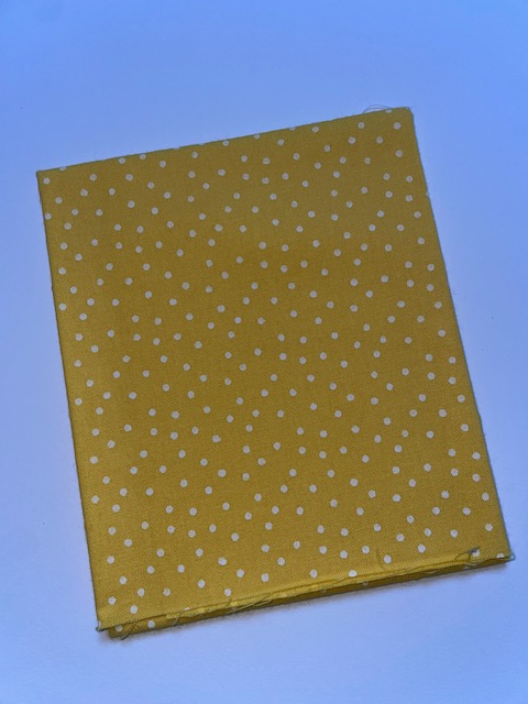
The brief suggests that if your textile sample has bright and garish colours, could children’s toys be an inspiration for the yarn designs. I found some small Lego pieces that matched the colours on the textile sample and drilled some holes through them to attach to yarn. Using a white thread as the base, I attached different coloured beads, orange pipe cleaners and these Lego pieces to create this colourful yarn.
For the next yarn, I decided to use a different textile sample because I knew that I could expand my use of material exploration. I used some blue string that I found and made some leaf shapes out of clay. I then moulded them to the string and this was the outcome. I am pleased with how it looks and it clearly represents the textiles.
Texture and Tonal Qualities
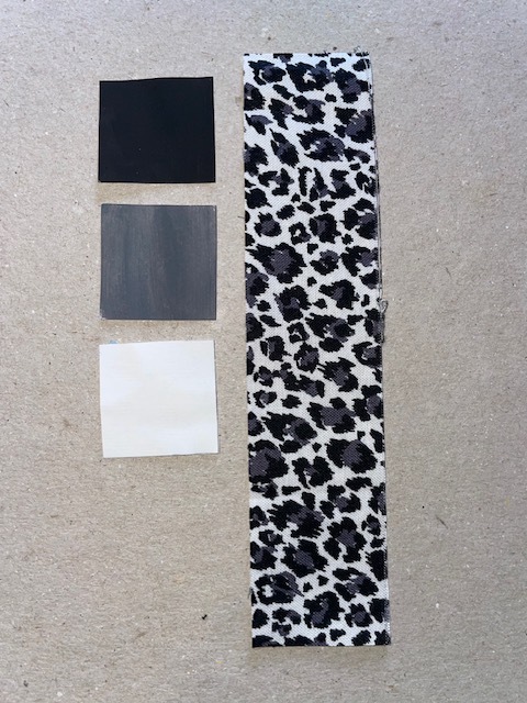
For this category, I had to look at my neutral colour palette and textile sample. The first section was to focus on the tonal qualities of the chosen pieces. I used a grey t-shirt to tie into a large knot and then with the black t-shirt I tied a strip around the grey know. I made 5 of these and attached them to a white thread. I’m happy that I have translate the tonal qualities and even the colour proportion however I think the white should have been more prominent.
The second yarn I made was a simple grey white and black plait. Looking at the previous yarn, I added a large white ribbon to the back of the plait because there was more of the white than any other colour.
The next section was to focus on textured yarn exploration. I decided to use the other neutral colour palette and textile as I felt I could get a better exploration with this. Looking at this textile, my first thought was grainy. I thought how can I create a grainy looking yarn and I experimented with sand. I mixed black paint and sand together and coated a plain white yarn in glue. I then dragged that yarn through the black sand so it sticks and this was the outcome. I believe it was successful because it translates the colour and it is textured.
The second textured yarn I made was with thin wire. I found some silver and black wire in my house and tried to make a yarn with this. When looking closely at the yarn, you can see the stitching it almost like a zigzag pattern so I wrapped the thin wire around a skewer stick to create a spring. I then squashed it to make it flat therefore looking like a zigzag. I made 3 silver and 2 black and tied them together to create this textured piece.
Overall this exercise was very fun for me. I felt like in the last exercise I was being too particular with my work whereas I loosened up a bit in this exercise and pushed myself out of my comfort zone. I enjoyed exploring all the different ways of creating yarns and I feel like it’s been successful throughout.
The aim of this exercise helps to expand my knowledge and application of materials into yarn concepts. To interpret and experiment with different ideas to translate linear qualities into yarn outcomes. I will work to translate drawn and stitched lines into three dimensional lines in the form of yarns. I started by looking back at the work I produced in Part Two, the stitched paper samples and the stitched textile samples. I then had to choose one where the lines and marks are inspiring.
I decided to go with this textile sample because it has many lines to work from. Using this, the task was to create a variety of 30cm lengths of yarn with a range of thicknesses and textures based on a 1cm repeat, 5cm repeat and a random pattern.
For the first yarn, I attempted to translate the squares in the tatting technique using the 5cm repeat. I think I was trying to copy the piece too much rather than just focusing on the marks. So for the next yarn, I pulled apart the yarn I was using to single strands and then tied them in a 5cm repeat. Following that, I used a single strand of that yarn, some thick thread and embroidery thread and plaited them together. Again, tying knots in a 5cm repeat.
For the 1cm repeat, I ripped up an old black t-shirt and translated the French knots on the sample by tying black fabric to a strip of that fabric 1cm apart. I then decided to make a longer version but when tying the knots, I kept the ends a bit longer to create texture. For the random patterning, I ripped up and old grey t-shirt and use some fabric from the black t-shirt and plaited them together using 2 strands of grey and 1 of black. I went in and tied white yarn to the plait in random places.
The nest task was to develop three designs further based on the 30cm explorations but this time, with a lengths of 100cm. I started with a simple white yarn using 3 strands side by side at 100cm each and tying each end to keep them together. I used a thin black thread to knot around the new thick white yarn with a 5cm repeat. I like this one because it translates the marks made on the sample and focuses on the colour proportions.
The next 100cm yarn I created was using the grey t-shirt. I cut a length of 100cm and started tying small strands of the t-shirt along it at a 1cm repeat leaving the ends loose to add texture. I then added black and white thread twisting around the full length of the yarn to include the colours used in the sample.
The final yarn I made was a little more adventurous than the others as I sourced new materials and included them in this yarn. I found some beads and picked out black and white ones varying in shapes and sizes. I cut a piece of thick white thread at 100cm and tied some knots to allow for the beads to stay in place once on the thread. I created a random pattern with the beads and then added black thread wrapped around the full length.
This exercise was the first one in Part Four and it was a challenge because I tried to recreate the sample as a yarn. I was getting frustrated because it wasn’t looking the same but once I got that idea out of my head. It became a little easier to work with.
Yarn is a continuous length of fibres that are interlocked used to create textiles but can also be used for crocheting, knitting, embroidering and ropemaking. Yarn can be made from a variety of fibres including natural and synthetic fibres. The most common natural fibre is cotton and the most common synthetic fibre is polyester. Animals fibres can also be used to create yarns such as wool harvested from sheep or cashmere harvest from goats. The list goes on.
Textiles are used in everyday life from clothing to home textiles and industrial textiles such as conveyor belts and it all stems from yarn. Some yarns can be more rigid than others and it all depends on their construction. If the end use was a flame-retardant sheet or furnishing then the yarn would be tightly twisted whereas a knitted scarf may not be as tight.
Large international fairs are held each year to present new yarn ideas and designs. One being the Pitti Immagine Filati in Florence. They exhibit the best of global yarns and knitting, attracting international buyers and designers who find inspiration from diverse cultures and show their latest innovations.
Another international fair would be the Heimtextil International Trade Fair for Home and Contract Textiles held in Frankfurt. The next fair/exhibition in 2024 will present a global range of product innovations in textile interior design. It also maps market changes with its focus on interior, architecture and hospitality.
In this assignment, the task was to use the work created in Projects 1 and 2 and create a colour resource book. The aim of the book was to get across everything I’ve learned during the exercises. The first thing I needed to do was to figure out how I was going to construct the layout of the book. Using a plain white background, I decided to use thick card to mount my work onto. I had to use the full A4 card in a landscape format because some of my work was as big as A4. I kept it simple and left plenty of space around each piece of work to allow the focus to stay on my work. I had to decide on what pieces to include in the colour resource book. Looking at the work I’ve done in this part of the course, I wanted to include it all as it shows my strengths and weaknesses. It was all a learning curve and I believe I have created some beautiful pieces of work. I presented it in order of how the exercises were given to me. The only pieces I didn’t include was 2 of the watercolour stripe designs because I felt the three that I’d selected were the best out of the 5 I had done.
Once I had figured out what work I was going to use and how I would present them, it was time to construct it all together. I had all the work stuck down and in order so I just had to decide on what text I would use to label it. I had to keep it simple to focus on the important parts so I used a website called DaFont which I used to use in my media classes in school. It’s a brilliant tool to create headings or titles. I chose a font that I liked and printed the titles of each exercise. Once they were printed, I decided to colour them in to represent the ‘colour’. The front page says ‘colour studies’ and I coloured them in a rainbow pattern. All the other titles were coloured in different shades of one colour. The last thing to do was to bind all the pages together. Carrying on with the simplicity, I use a holepunch to create holes down the left side and used ribbon from the translation through yarn exercise to tie it all together.
Overall, I am pleased with the outcome of this book. I have kept everything to a minimal to allow the focus to stay on the important parts. Using card was definitely the better option in comparison to paper as some of the work was heavy and paper wouldn’t be strong enough for it. I enjoyed creating this book because it pieces all my work together nice and neatly.
Written Reflection
This part of the course was really fun for me. I have never worked with gouache paint before, I had the option to when I was studying art in A-Level but I chose other options instead so it was something new for me to try. I went and bought a new box of gouache paint so that was exciting too. I worked with colour a lot when I was in school meaning that the gouache exercise and the watercolour exercise was fairly easy for me in terms of mixing colours. I will admit the gouache was slightly harder to get the right colour but once I got the hang of it, it became easier. Extending the 10cm sample to 20cm with the paint was probably the best part for me because I had fun doing it and the outcome was great.
The translation through yarn exercise was an interesting one because my nan had all the materials in the world so I could choose almost every colour within the chosen image. Yarn wraps were a new concept for me and I’d never done anything like that before but I felt like I had translate the colour well and used my resources effectively. I will definitely use yarn wraps in future projects as a way of extracting colour. The watercolour exercise was fun because like I said before, I’ve played around with it in the past. The collage exercise was another fun one to do but it was also a challenge. Creating the colour book was a really nice way to tie all my work together because, being a perfectionist, it was satisfying to have all my work neat and in order.
281 words
Reflection
Demonstration of technical and visual skills:
– My use of materials, techniques and observational skills are definitely improving as I move on through the course however, I could have a wider variety of materials.
Quality of outcome:
– The content of my work is strong and detailed and the presentation of my work is clear and coherent.
Demonstration of creativity:
– I believe my personal voice is improving as well as my experimentation but my experimentation could be stronger.
Context:
– I reflect on my work in every exercise on my learning log but I know I need to be more critical when talking about my work. Researching is a strong point but I could expand my resources to books or something other than a website.
The aim of this exercise was to help develop my collage skills focusing on colour and composition. Starting with taking a photo of a ‘messy’ part of a room with normal everyday clutter. Then, observing the photo, I had to gather a variety of papers that suggest the colour complexities and story of the photo. I had the choice to prepare some coloured paper myself with paint.
Part 1
Using my photo, I then had to prepare three collage studies that capture the colour and composition. I took a photo of the corner of my room because I felt there was a lot of colour to work from. I zoomed into the the photo and cropped it to have a more focused area. I then used ColRD to pull the colours from the photo which allowed me to make the right selection of colours for each collage.
The first collage I created was a silhouette of some of the main colours and objects. I’m really impressed with the outcome of this collage, I have successfully represented the colours and proportions.
The second collage was to incorporate unusual colour combinations. This one was tricky for me because I couldn’t figure out what unusual colour combinations were. Even colours I wouldn’t normally put together somehow worked together. I used the colour wheel for reference to figure out which colours dont go together and went from there. I started ripping some paper up and sticking them to the backing paper.
The third collage involved a complex colour combination. When thinking about what ‘complex’ is, I would think that it mean many different so in this case, many different colours. I decided to lay out this one in an abstract stripe pattern following on from the watercolour study. I picked out the colours, ripped up some paper and stuck it in the order of colour in the photo. I just looked at the image and tried to include all the colours that I can see. I feel like I have successfully represented the complex colour combination as well as including the colour and proportions from the photo.
Part 2
This next part was to develop one of my collages further. I chose to use the first one as it was my favourite out of the three and I like the blocked silhouette version of the photo. The first collage needed to be a monochromatic using black and white. I took the coloured collage and photocopied it in black and white, it really helped to depict which of the colours were black and which were white. I believe I have created the monochromatic version well, however, looking at the finished piece, I could have used a better variety of papers such as receipts or newspaper.
Photocopied CollageMonochromatic Collage
The next collage needed to be a single colour collage. I decided to go with purple as I had more different shades of purple than any other colour. I also painted some pieces of paper in purple to include a couple more shades. It was important to retain the same tonal colours as the original and I believe I have done this.
The final version needed to be a multicoloured collage. I had some patterned paper and decided to use some of them in this piece to give some variety. Although, the tonal colours aren’t similar to the original, the shapes definitely represent it. By using the patterned paper, it brought more colour and therefore is successful to the brief.
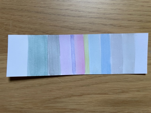
The aim of this exercise helps to gain understanding of opacities of colour through recording of transparent objects as well as extracting colour palettes and proportions from a self selected visual source. Starting by collecting a range of 5 transparent vessels such as glasses, vases or containers. I found a few objects varying in colour and set up a white paper background to produce still life arrangements. I experimented with the layout of each object and swapped a couple objects. Then, I had to step back and focus on the subtleties of colour and how the lighting source might impact them, or how the colours might change as the objects overlap.
Once I had got an idea of the colours. I had to paint a series of stripe designs based on those colours using watercolour paint with no gap in between to analyse the relationship of each colours. This is the first design I painted, I didn’t take into consideration the proportions of colour or go into detail with the colours. The same with the second design, I did however, expand my colour palette further.
First DesignSecond Design
The third design was a little more accurate taking into consideration the colour proportions. Some lines are thicker depending on how much of the colour can be seen in the still life.
Third Design
The fourth and fifth design was the most successful in my opinion because the colours are much brighter and the proportions are correct. I realised that I focused more on the still life with the pink glass in it because it brings more colour to the palette. I was more aware of the finer details between each vessel when painting these last designs.
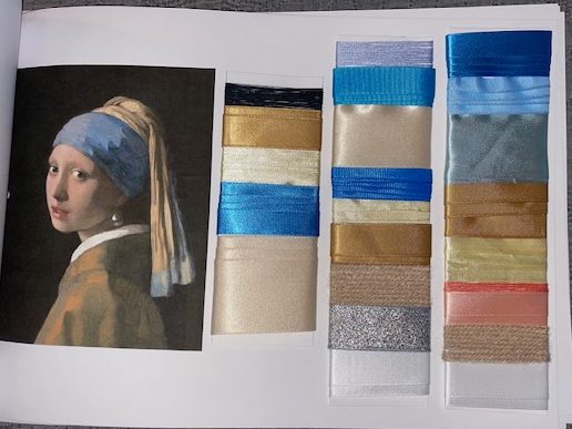
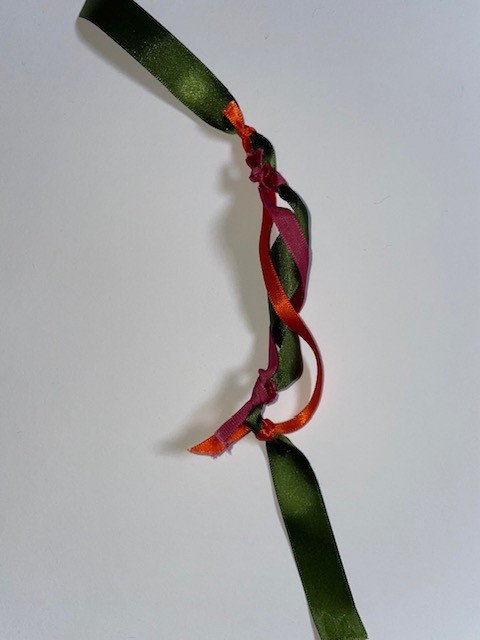
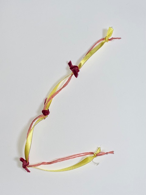
The aim of this exercise helped me to interpret colour and colour proportions from a 2D image through yarn. I had to extract, explore and present a palette of colours. Firstly, I had to select a good quality image of an Old Masters painting that is rich in colour use. Second, I had to gather appropriate yarns, threads, ribbons or trims and present them in linear form to represent the colours in my chosen image. Then, I had to cut a 5cm by 20cm strip from card and arrange my yarns in stripe format varying the width to demonstrate the proportions of colour within my chosen image.
The image I chose was the “Girl with the Pearl Earring” by Johannes Vermeer because when research Old Masters painting, this is the one that stood out the most due to the varying colours. I decided to use ColRD from the previous research point to pick out colour that would assist me in my yarn selection.
I began to gather yarns, threads and ribbons from my house and from my nans house. My nan has an abundance of all these items in a wide range of colours and sizes which was really useful to me because it meant I didn’t have to go out and buy any new ones.
The first yarn wrap I did, I tried to include most of the colours that can be seen in the painting. Looking at this one, I realised I have unintentionally organised the materials in an order of light to dark. The second wrap is the main colour palette of the painting. I didn’t have any black ribbon and I forgot to look for some at my nans so I used black thread. I definitely should have done the black section darker than the rest as it is the most prominent colour of the painting. The third wrap was focused more on the lighters colours as well as the blues. I included the silver strip to represent the lady’s pearl earring as it has a shine to it in the painting. I wanted to include different shades of blue as that is another main colour.
Overall, I enjoyed doing this exercise because I could get creative again and I enjoy hands on work. If I use a yarn wrap in the future, I would probably use a thicker card or even cardboard and make sure each material was tight because you can see ripples where they have overlapped each other. However, each yarn wrap is successful in their own way.
For this research point, I was given a list of software’s to explore that are used for colour matching. The list includes:
Adobe Colour
MudCube Colour Sphere
Colour Halipixel
ColRD
I selected an image to use on each software. Starting at the top of the list with Adobe Colour, you simply upload the image to the software and it pulls out the colours used in said image. The first image is the colour gradient whereas the second image is the colour theme. There isn’t an option to have more colours selected than the five in the second image so its not precise.
The next software I used was MudCube Colour Sphere. This one was difficult to use and there didn’t seem to be an option to add your own image, you could only change the selection of colours.
Colour Halipixel is another software which was difficult to navigate. There was no where to add your own image, you had to use your mouse up and down or side to side and click to select the colour. Neither of these websites were user friendly as there was no tutorial or instructions on how to use them.
ColRD was the best one from the list in opinion. You upload your image and it picks out the colour palette for you. It gives you 78 different colours pulled from the image alongside the image itself. It then gives you 5 colours along the top which are the main colours used in the image. I prefer this software than any of the others because it is more precise.