A point has many different meanings depending on what you are using it for. In this context, a point is small within the frame and the position is more important than the form. The brief for this exercise asked me to take three or four photographs with a single point placed in different parts of the frame following these three rules: the place of the point shouldn’t be too obvious, use rule of thirds when composing the shot and the point should be easy to see.
I set up my camera with a fixed frame and selected an object to work with. For this activity, I used my dog’s toy. I thought it would be an excellent thing to use because it is yellow and therefore stands out among the others. I began distributing it throughout my garden using the rule of thirds. The first three photographs are nice since they adhere to the rules. However, the fourth photo is difficult to find since, in order to obey the rule of thirds without repeating the first few photos, I had to position the point far back in the garden.
Once we’d taken those images, I had to take three more with no restrictions. I figured I might have a little fun with this one. I kept the frame exactly as it was and moved the point to other locations. If you didn’t know the brief for this exercise, you wouldn’t notice the first photo because there are so many elements in the frame. Moving on to the second shot, you are instantly drawn to the point because it is not only in the center of the frame, but it is also bright yellow and hanging from the washing line, making it difficult to overlook. For the final photo of these three, I was preoccupied with deciding where to position the point. Then my dog wanted to play, so I photographed her and the point together. I had fun with these three images since I followed the brief while keeping it entertaining.
In this exercise, the brief instructed me to capture three or four exposures of the same scene while maintaining the same frame. The goal is to comprehend that, while the images appear to be identical, the histogram data may show minor differences between them. This is an example of how rapidly the world evolves. Even if you adjust the test conditions, such as using a tripod to stabilize the frame or moving indoors, the histogram will vary. The four photos I took are included below, along with their time stamps.
14:43:1914:43:2414:43:2914:43:34
Here are the histograms for the four photos. At first glance, they all appear identical. However, the longer you analyze each histogram and compare it to the others, the more disparities you’ll see. There are five seconds between each photograph. These images were taken in a total of 20 seconds, with tiny changes between each. This again, emphasizes how rapidly the world evolves.
’In our earliest years we know a patch of ground in detail we will never know anywhere again – site of discovery and putting names to things – people and places – working with difference and similitude – favourite places, places to avoid – neighbours and their habits, gestures and stories – textures, smells – also of play, imagination, experiment – finding the best location for doing things – creating worlds under our own control, fantasy landscapes. (Professor Mike Pearson)
Photographers and artists have always found inspiration in their immediate location. There is a concept within Welsh culture called Y Filltir Sgwar (The Square Mile), described above by Professor Mike Pearson. It is the immediate connection between people and their childhood ‘home’ surroundings.
This assignment asks us to create a series of six to twelve photographs in response to the concept of ‘The Square Mile’. I decided to re-trace places that I know in and around my hometown. My initial idea slightly deviated from the concept. I wanted to capture the areas that I would hang out as a child which would be a square mile within my village. However, the series I wanted to create was similar to a before and after concept. The before being areas I’d hang out in as a child and the after being places I’d hang out now that I am older. So, the first set of photographs in the series follow the Square Mile concept. The second set deviate from the concept but follow on from the first set complementing each other nicely.
The first six photos are familiar areas that I used to hang out in as a child, I was young and playing out in the fields was the best thing to do. The last six photos are areas I’d hang out in as I got older. I started to drive and could visit different places. The pubs became the familiar places.
Remnants of a Rope SwingDerelict Farm VehiclePlaying FieldFamiliar RoadLeading from Waterloo DriveAbbey LawnsMy CarTown CentreThe Nags Head PubToft Tunnel – DerelictLocal – Specifically the Beer GardenLocal
Artist Research
I was given a list of artists to research and the first one to catch my eye going down the list was Gawain Barnard. He is a Welsh photographer whose work combines documentary techniques with poetic sensibilities to create a constructed visual narrative. He made a few series of photographs focusing mainly on nature. This is what drew me to his work because I thoroughly enjoy taking photos of nature myself. Particularly the Transitional Echoes series. If I was in that setting, I would have taken that photo myself. I like the eeriness of the trees in the fog.
The second artist in the list that caught my eye was Roni Horn. Particularly her photographic project titled Her, Her, Her and Her. Horn was intrigued by the 1928 swimming pool locker rooms because they resemble a seemingly never-ending maze of passageways and compartments with peepholes in the doors creating an endless network of views. I was drawn to this because of the context behind it.
The third artist that drew me in was Tom Hunter with his Ghetto Series. The photographs feature his friends and neighbours in Hackney when he was squatting in the London Fields East community. They were taken as a part of a campaign to protect the community from developers and the Hackney council. Fourteen years later, the community remains and is central to a thriving Hackney neighborhood, where the artist, Tom Hunter, still resides. I particularly liked this series because I enjoy taking candid photos of friends as they capture the present moment which you look back on in the future and reminisce.
Last but not least, this artist inspired me the most with their photographic projects. Karen Knorr is a German artist who uses documentary photograph techniques. The Belgravia series, set in 1979 London, explores class and power during the early Thatcher era through images and texts. Focused on the cosmopolitan and wealthy Belgravia neighborhood, the series includes the artist’s own family but aims to depict a group and their ideas rather than individuals. These “non-portraits” avoid flattery or truth, leaving subjects anonymous. The work captures the everyday life of a privileged minority and blends image and text to create a sarcastic, yet realistic, depiction. The collaboration between the artist and subjects, who are treated as actors performing their identities, adds a constructed and ironic layer to the series.
Summary
The initial response to the “Square Mile” project, which involved exploring and documenting a specific one-mile area, I felt a sense of confusion. This confusion stemmed mainly from the Welsh name for it, I don’t understand the Welsh language therefore struggled to pronounce it let alone understand it. It was difficult to understand the depth of the task within the confines of such a seemingly small and defined space but I feel like I was just overthinking that part.
I looked at the work of all artists mentioned in the list however, the four artists I chose – Gawain Barnard, Roni Horn, Tom Hunter, and Karen Knorr – offer valuable perspectives that will significantly influence my future work in this project.
Reflecting on my own strengths, I realize that my ability to capture unique angles in photographs is a significant asset. This skill allows me to present familiar scenes from fresh perspectives, uncovering hidden aspects of the environment. However, the weakness in this project was that I did not utilized my DSLR camera or any advanced editing techniques, relying instead on more basic tools such as my iPhone. This limitation has likely impacted the quality and depth of my photographic work. However I believe my photos are still of a good quality and communicate my idea nonetheless. Moving forward, I will incorporate my DSLR camera and employ editing techniques.
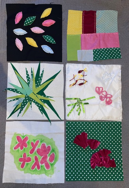
In this final assignment, I had to consider all the work created in Projects 1, 2 and 3 and aim to communicate the particular discoveries that I found exciting. I made some notes in my notebook about which were the most successful and decide to develop them further. This was an opportunity to improve upon my experimental samples by refining the techniques. I had to create 6 samples of 30cm by 30cm in size.
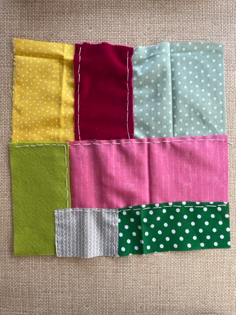
Firstly, I researched the actual definition for patchwork because I always thought it was patching fabric on top of each other and I wanted to see if that was correct or not. Turns out that you are meant to patch the pieces together so I took that on board and created a patchwork textile 30cm by 30cm. I selected the coloured fabric that relates to the colours on my primary source photo. I then cut them to the proportion of colour on that photo. I used normal cotton, felt and velvet and sewed them together using white thread. Although it was my first proper attempt at patchwork, I was pleased with the outcome.
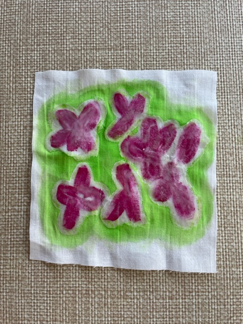
The batik I did for Project 3 was the first I’d done in many years. I pretty much did the same thing as the small textile but this time I refined my technique. I forgot that when you have finished the dying of the fabric, you’re meant to iron the wax out to bring it back to a normal fabric with no wax. I painted the pink flowers, covered them in wax and then dyed the fabric green. Once it was dry, I went back in with a darker shade of green and made the little flicks coming out from the flower. When that was done, I ironed out the wax sandwiching it between some sheets of brown paper that soaked the wax up.
For this textile, I selected a dark green cotton fabric as the background cutting it 30cm by 30cm. I wanted to expand on the three dimensional flowers that I made in Project 2. Using the same velvet fabric, I cut thicker strips than the small version because I wanted to make big flowers. I am pleased I did because the fabric flowed more with the larger strips which created a better overall look.
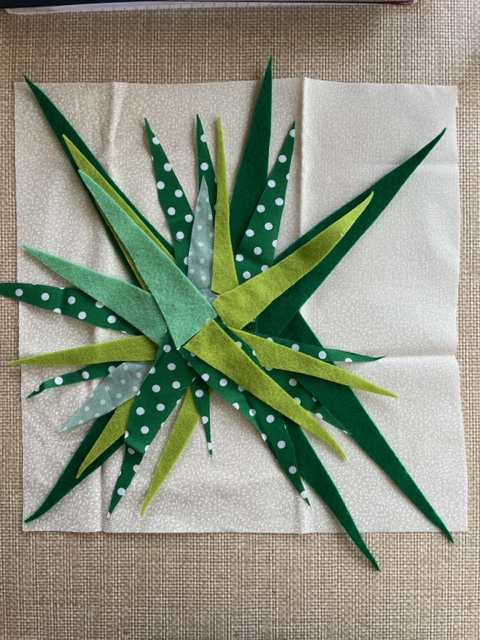
This textile has a variety of different fabrics involved in many shades of green. Following on from the textile sample in the previous project, I wanted the improved version to be louder in terms of size and colour. I cut many pointy strips of all different shades of green and then began placing them on the white fabric. Once they were in their designated position, I made a very small stitch, enough to keep them in place but still allow them to move freely. Layering the leaves on top of each other eventually created a three dimensional effect.
This was more of an experimental piece because I knew what I wanted to create in my head but I wasn’t sure how it come out on fabric. I also experimented with a new technique called quilting. I used 2 layers of silk fabric with a layer of cushiony fabric and sewed them all together to create a quilt. I then added features that translate the colours and proportions from the primary source. I really liked how the quilt felt when I’d finished it and I’m pleased with how the experiment turned out.
I chose to do something slightly different to the sample textile. Still using the black fabric, this time I wanted to make three dimensional leaves that stick out of the fabric. I made 10 leaves of about 8 cm in size and 5 different colours. I stitched the back and front of the leaf together using black thread and a back stitch leaving a little hole to put stuffing inside. When the stuffing was in, I closed the leaf up and attached them to the black backing fabric using the same black thread. This was a successful piece and I achieved what I wanted to do.
When all 6 samples were done, I had to present them in a clear manner. I had to consider whether they sit well next to each other and complement each other. I laid them all out and put them in a way that I felt either had matching materials used and therefore creates a continuous theme or they just complimented each other in some way.
Written Reflection
Throughout this part of the course, I have felt like I have been so creative when working and I have thoroughly enjoyed it. I was able to use more tools and materials when experimenting with my work. I kept pushing myself to be more adventurous and I felt like I have made some strong pieces. I have also learned a lot throughout this part.
Learning the proper way of making a patchwork piece was good because it allowed me to build my knowledge. Once I knew how to do it properly, the idea of what I was going to do came a lot easier to me. I wanted to translate the colour proportions of the primary source and I think that was successful.
It was good to work with the batik technique again because I always loved doing it school. I didn’t have the full range of equipment needed but I made do with what I had and it turned out amazing. I will definitely use this technique in the future but I would use a tub to dye the full fabric next time.
The three dimensional flowers was fun to do and I loved the final piece but looking back on it, I could improve it a lot more. I could have filled the 30cm by 30cm fabric and spilled over the edges instead of keeping them so tight together.
The spider plant piece was successful and came out better than I thought it would. I managed to include a few different shades of green and a variety of leaf shapes. It was even more rewarding when it started to raise the more layers I added because it made it pop out of the fabric more.
Quilting was another fun one to learn and create that I will use in future projects. I like that the features on top of the quilting is minimal because there wasn’t a main focus other than the quilt. I think in future, I would experiment turning a batik textile into a quilt.
The three dimensional leaves was a skill I have learned before but it was good to use It again. Some of the leaves ended up thicker than the others because I added too much stuffing but it turned out great adding more texture to the piece.
Looking back at Ofili’s statement from the introduction of Part 5 and getting to the end of this part, I agree more with what he says about the exhibition not being the conclusion. As I said before, all work done leads to the next piece of work. If I wanted to expand on this capsule collection, I could turn them into cushions with them being a good size for it therefore this ‘ending’ wouldn’t be the end.
For the overall course, it was a challenge for me at the start and it was a rocky road. I struggled with my ADHD and the mental wall came up again stopping me from doing anything but I have had so much support from family and friends that motivated me to knock that all down and crack on with it. I’m glad I did because I’m determined to finish what I set out to do.
537 Words
Reflecting on Assessment Criteria
Demonstration of Technical and Visual Skills
My use of materials have been constantly improving throughout the whole course and I feel like I had used a variety of different materials in this part of the course. I have also gained knowledge on more techniques. My designs and composition skills have improved massively and I know what I need to work in future projects to improve it more.
Quality of Outcome
I feel like the presentation in my work has improved, everything is clear and easy to understand. I am able to communicate my ideas effectively and put ideas to paper.
Demonstration of Creativity
I have definitely been more creative towards the end of this course compared to the start and that’s because I have pushed myself out my comfort zone to be more experimental. I am pleased with the outcome of all my pieces in the last two parts of this course and I feel like I have created a good variety of work.
Context
I am able to reflect on my work thoroughly and pick out the strengths and weaknesses. I know where I need to improve on things and how to go about it. I feel like my critical thinking is still improving but I think that comes easier the more you do it.
In this project, I translated the qualities in my drawings into material and stitch exploration. The main focus was experimentation and taking risks with the methods used.
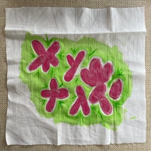
The first method I wanted to experiment with was a technique called batik. I had played around with it in school but that was a long time ago. I didn’t have the right wax so I just used a normal candle. I painted on the pink flowers onto white fabric and then using a paintbrush, I covered the pink flowers in wax. Once that was dry, I dyed the background in a light green. It worked well because the dye didn’t run into the flowers.
The next experiment I did was cutting leaf shapes into the black fabric and then sewed coloured fabric to the back of the leaf holes. I had to be careful when cutting the holes as the fabric kept fraying but it turned out how I imagined it to.
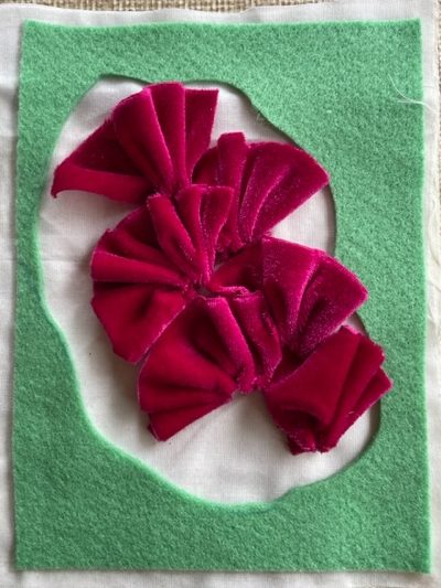
This was an experiment with felt and velvet. I cut a hole in the middle of the felt and stitched to the white fabric. With the felt, I wanted to make the flowers three dimensional. I cut a 6 strips from the velvet varying in size and stitched the bottom them each. I pulled them tight and then stitched them to the white background in the centre of the felt. I feel I have achieved what I wanted to do with this textile.
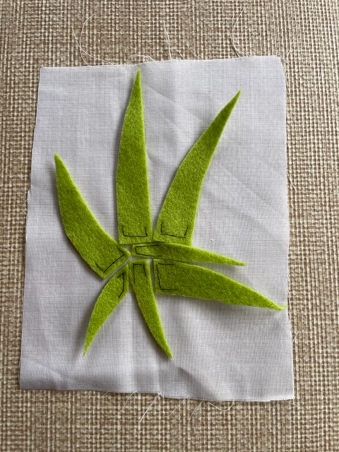
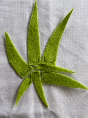
This textile translates the paper concept I made. I cut some pointy leaves out of a light green felt. I positioned them on the paper and then sewed the bottom of the leaves to keep them in place. I left the tops to flow to give a three dimensional effect,
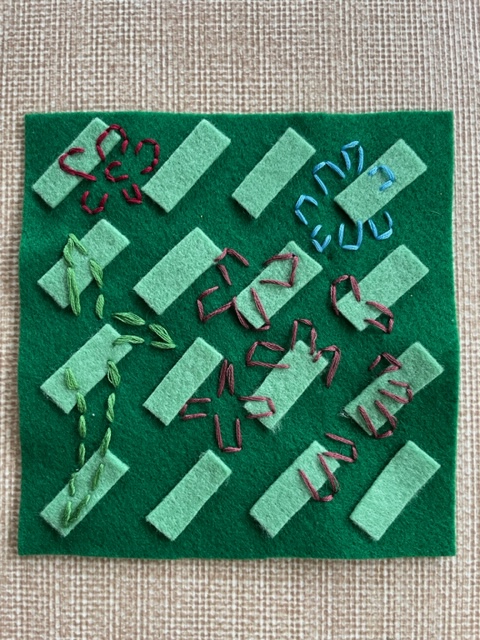
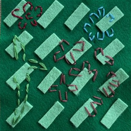
This is another experiment with felt using the drawing as inspiration. I cut thin strips from a light green felt and sewed them onto a darker green felt. I then translated the marks by selecting colours of embroidery thread and stitching into the felt. It was difficult to get the needle and thread through the pieces of felt that overlap and I ended up with a sore thumb but it turned out good.
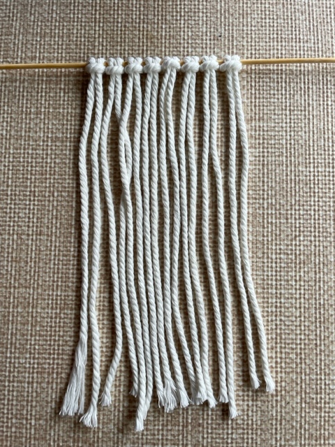
This was an experiment with macramé. I gathered some string and cut them all into the same length. Using a wooden skewer, I tied the lengths of string to it and began to tie knots using multiple half knots. It was definitely a learning curve as I I should have made the string lengths longer. The design was meant to be a flower but I had to stop halfway because I ran out of string. This is a still a technique I’d like to play around with in the future.
For this experiment, I wanted to make some three dimensional embroidery flowers. I thought about what I could use to build that effect. I came across some wire that I stripped to use the plastic coating. I threaded the thread through the pipe twice and pulled it tight to create a curve. I then began to wrap that thread around the pipe. I only made three because it was very time consuming but it turned out how I imagined.
I wanted to attach the coloured ribbon to the fabric. Instead of sewing the ribbon to the fabric like I did on the left side, I thought I’d experiment. I used normal white thread and made some stitches into the fabric. I made the stitches loose to create a loop and then tied the coloured ribbon to the loops.
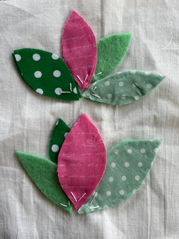
In this experiment, I wanted to use the layering technique. I used normal cotton fabric with felt and cut leaf shapes out. I then attached them to a white background layering them on top of one another in a flower design.
In this project, I wanted to keep pushing myself out of my comfort zone and I feel I have done that with a lot of the textile pieces. Some of them, I looked back on and thought that I could have done something a little different but I feel like I have some strong pieces of work here.
In this project, I had to think about all the ingredients and tools needed to build towards textile experimentation. I had to make selections and observations that would directly inform the work in Project 3.
Identify and Present your Colour Palette
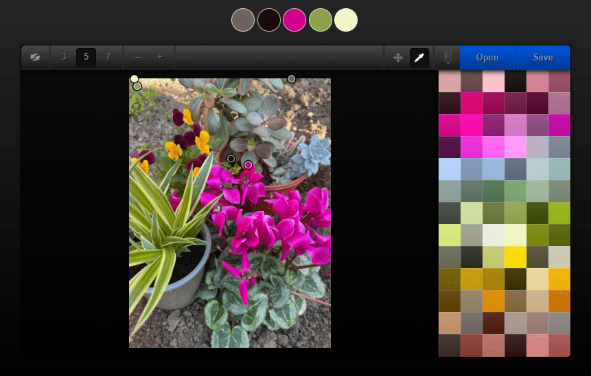
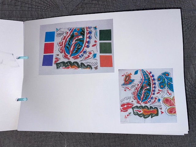
Working from the drawings in Project 1, I had to paint out some colour chips to extract the colour from one or more of the drawings. I thought ahead when doing my paintings and painted colour chips as I went along so I didn’t have to try and mix it again. I made the squares 3cm by 3cm because it shows enough of the colour. I also decided to use ColRD again with the still life photo to extract a full colour palette.
Be Inspired by an Artist or Designer
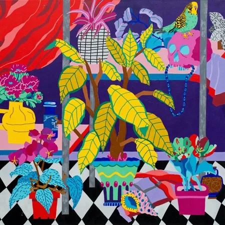
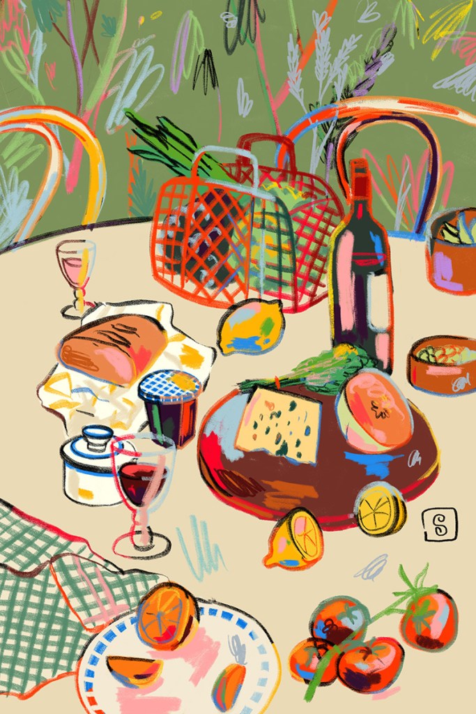
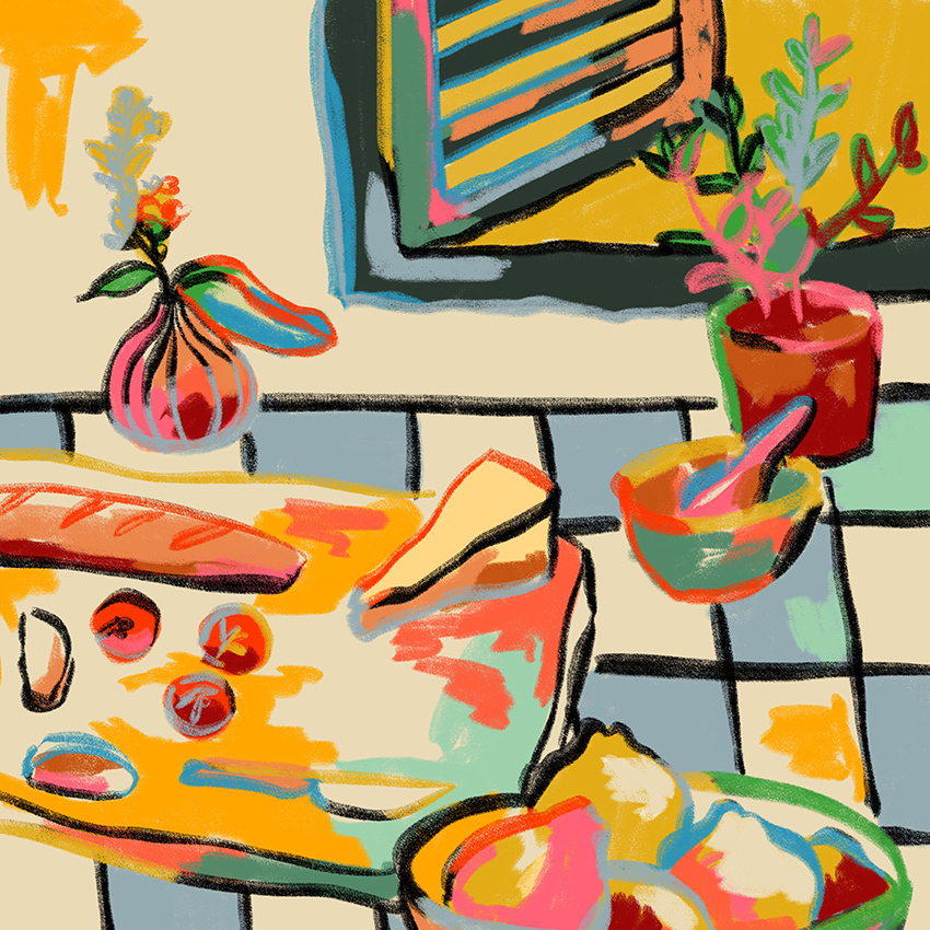
In this section, I had to find at least one artist whose work and use of colour was inspiring to me. I started by researching artists with floral still life paintings. The first piece of work that caught my eye was Florent Stosskopf‘s Still Life With Bird And Shell made in 2020. The bright and bold colours are what drew me in because I had just used bright and bold colours in my painting. Stosskopf is a self-taught painter from Brittany, France. His work is a mix of traditional themes and archetypes through a contemporary perspective. Using vibrant saturated colours, he removes the shadows to emphasize both the style and disconnect from reality translating the three dimensional objects to block colours and flat lines. Flower Shelf was another design that caught my eye with the playful vases and vibrant blooms.
Still Life With Bird And ShellFlower Shelf
Another artist whose work caught my eye was Sandra Poliakov. Specifically, Bread and Pasta Love and Wine Break. She also uses bright, vibrant colours in her paintings. Her still life portraits contain daydreams of outdoor picnics, long lunches and sun-filled days. Sandra tells Wrap Magazine “I notice the harmonies of colour in my everyday life. I like to express this in my work by combining colours which, according to ‘rules’, dont necessarily go together”.
Using the drawings from Project 1 as my source of inspiration, this section required me to develop a series of textile concepts using papers. In Part 2: Surface and Stitch, we were given a list of words that describe the treatments that can be applied to paper. The list of treatments I used were as follows:
Layering
Cutting
Folding
Tying
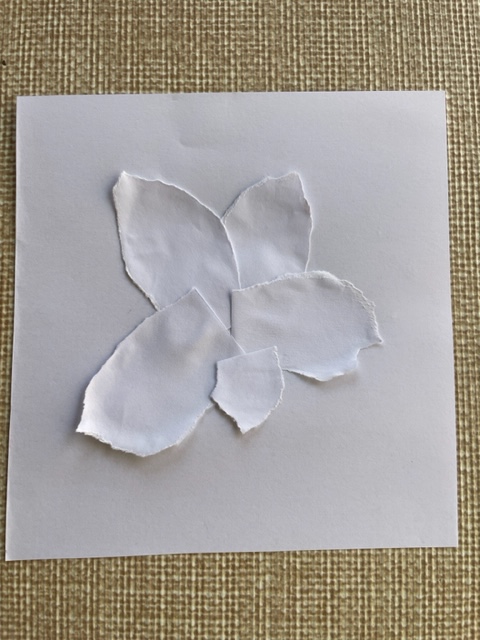
Tearing
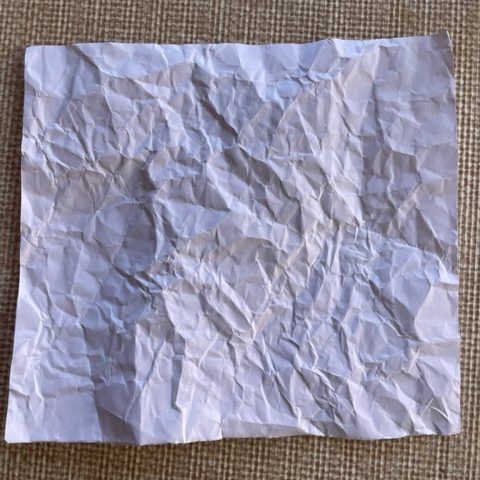
Crumpling
Twisting
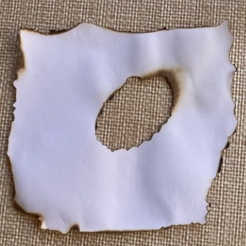
Burning
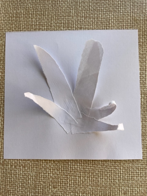
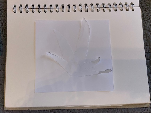
The first concept I made had the spider plant as the focus. I tore some strips of paper that went into a point. I then stuck them onto another piece of paper. I only glued the bottom of the strips to allow the tops to flow giving it a three dimensional effect.
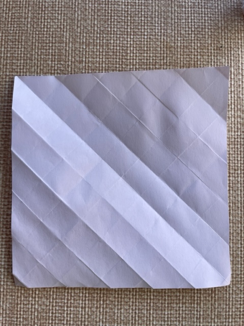
This technique involved me folding the paper in a diagonal way to relate to the diagonal marks on my painting.
The next technique I used was crumpling. I thought this one would be good to translate the finer marks in the original photo source.
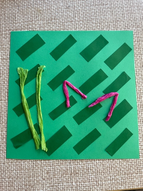
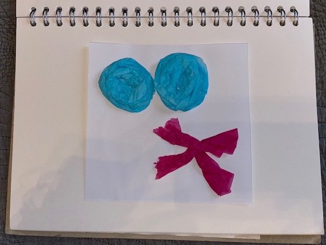
I wanted to make some three dimensional flowers so for this technique, I used coloured tissue paper to translate the colour from the plants. I rolled up the blue tissue paper, squashed them and then stuck them to the white paper. I folded strips of pink tissue paper and stuck them together to translate the pink flowers.
This technique was an experiment that I haven’t done in a long time. The last time I burnt paper, I was making treasure maps. I burnt the edges and then burned a hole in the middle. It was a little worrying at first as I didn’t want to set fire to anything around me but it came out good.
The next technique was another tearing piece. I tore pieces of paper into the shape of the succulent leaves and stuck them to the paper.
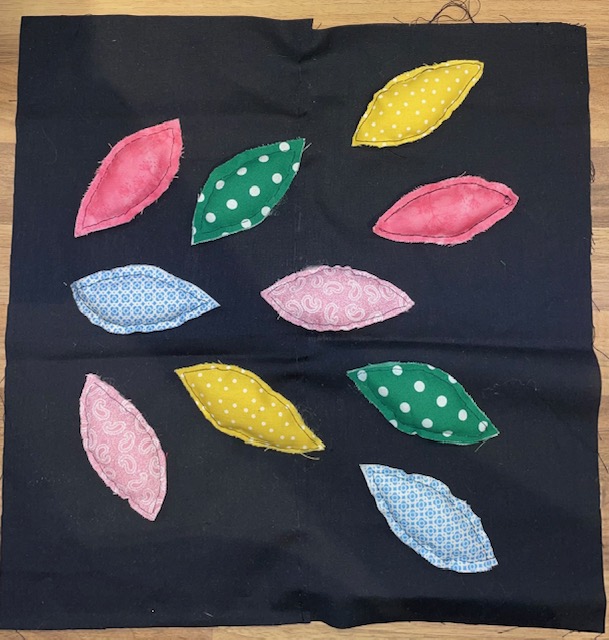
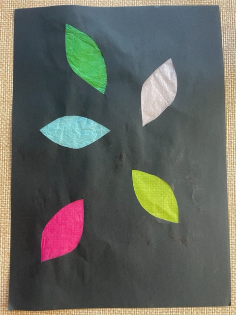
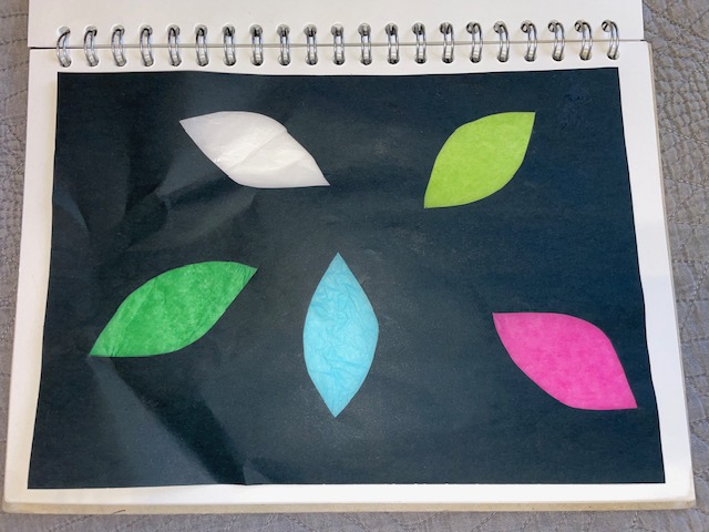
I used the cutting technique for this piece. I cut multiple leaf shapes into black paper and then stuck coloured tissue paper onto the back. I was more accurate with the colours this time compared to the painting.
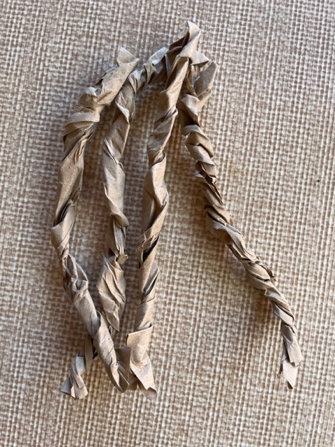
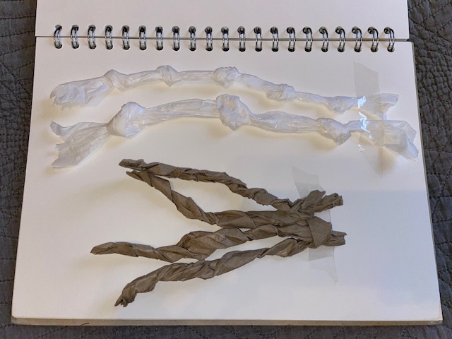
These two techniques are twisting and tying. For the tying, I made two. One with tighter knots and the other not so tight together. The other technique, I twisted brown paper up and made 4 strips.
This is another cutting technique. I used coloured paper and tissue paper to translate the marks in the painting.
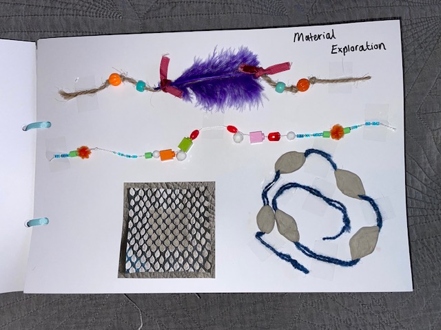
Develop Yarn and Linear Concepts
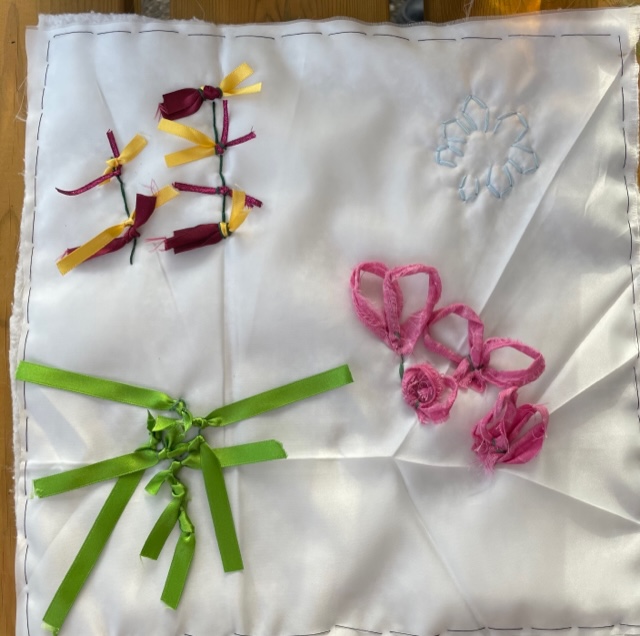
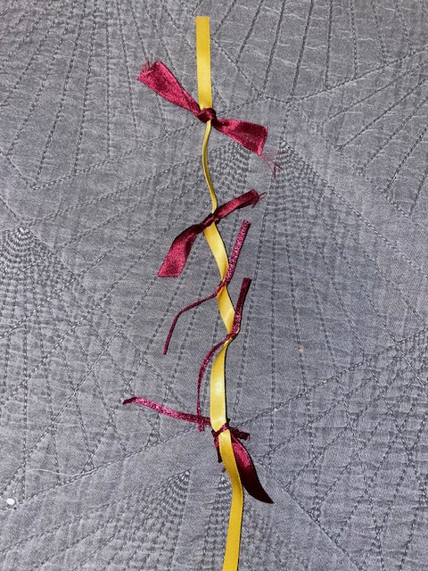
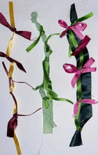
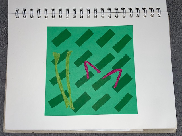
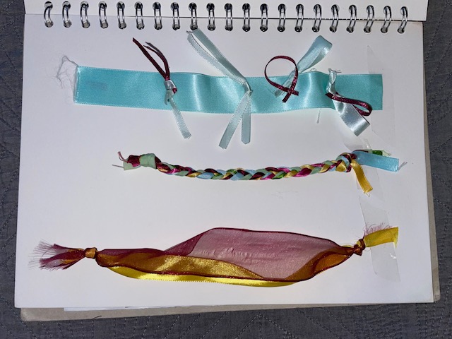
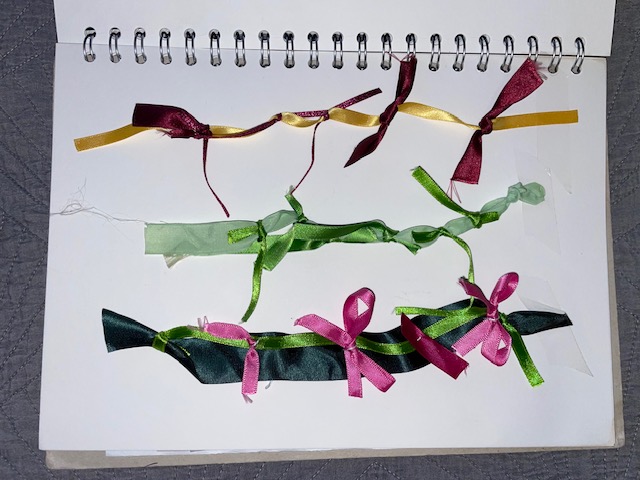
In Part 4 of the course, I explored many options for yarn development which I then employed in this part. I learned a lot when making the yarns in previous exercises so this section came rather easily to me. The first one I made focused on the yellow and burgundy flowers in the original source. I used the yellow ribbon as the base and tied the burgundy to it in a repeat.
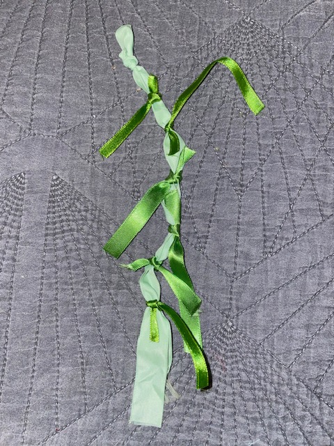
This yarn concept focused on the spider plant. I used a light green ribbon for the base and tied a darker green ribbon to it varying in sizes. I left them to hang to translate the spider plant leaves.
This yarn focuses on the succulent. I used a wide light blue ribbon for the base. I made loops in another lighter coloured ribbon and attached the burgundy loops to them to translate the tips of the succulent.
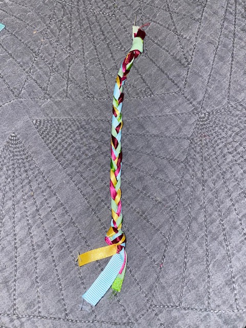
This yarn translates the colours from the whole image. I used 6 different colours and plaited them together.
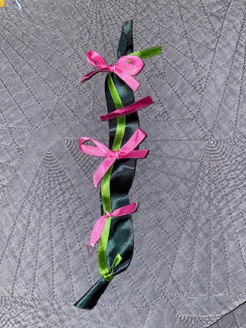
This yarn focused on the pink flowers. I used a dark green ribbon with a light green laid on top to translate the colours at the bottom of the flowers. I then attached pink bows to represent the shapes and colours of the flowers.
This yarn translates the yellow and burgundy flowers again but this time, the ribbon is side by side. You can see in the original photo that the yellow and burgundy flowers are side by side so I chose these two to translate it.
These three images below are important side by side because not only do they evidence the connections between my drawing, use of colour and yarn making, they also show the links between my research and design journey.
Produce a Workbook
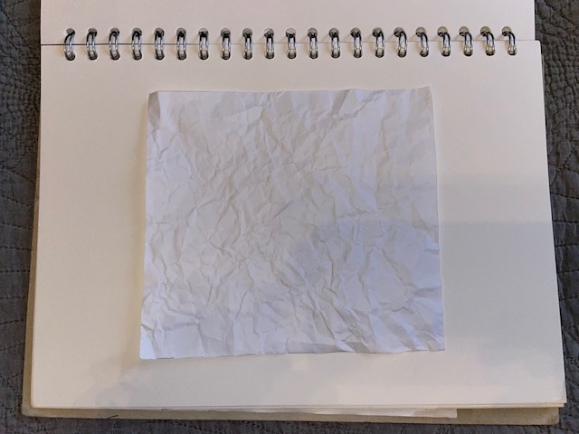
This section required me to produce a sketchbook or workbook dedicated to the work created in this project. I used an A4 sized workbook to present my work. I was already using a sketchbook for my work so I continued o use this to present my work. I stuck everything down with glue other than the twisted/knotted paper and the yarn design which I stuck down with Sellotape. The first 5 paper sample aren’t very clear because it was plain white paper, but you can see where I introduced colour and experimented more.
This was a fun project to do because I liked that I made a series of work and you can clearly see the links between them all.
This project requires me to choose one of the three options given to me.
Option 1: Strengthening a Theme
You should refer back to the work you created for Part One: Introductory Project. In this early stage, you explored a theme by putting together a still life set up and observed and recorded aspects of it through drawing and mark-making. You could go back and do more drawing to build on that theme.
Option 2: Back to the Archive
You should refer back to the work created in Part One, Project 2: Recording and Capturing. You selected archive textiles and recorded them through various means of mark making. You can either work from these archive pieces or your own personal archive and decide on a focus for your observation.
Option 3: Floral Compositions
Refer back to the work created in Part One, Project 3: Picking and Portraying. In this project, you sought to capture flowers, leaves and plants through your observation, drawing and mark-making. You should now plan a new still life to work from with flowers and foliage as its focus.
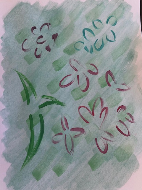
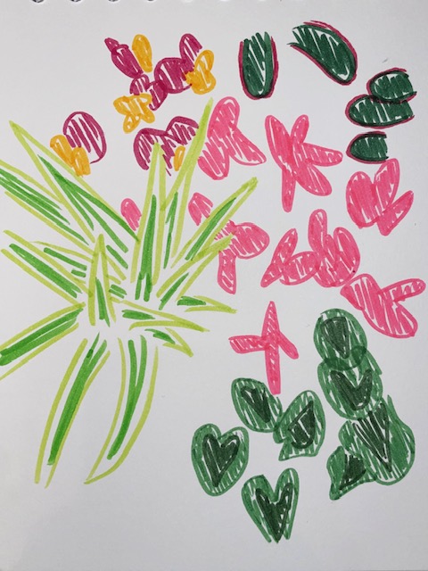
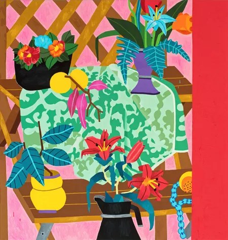
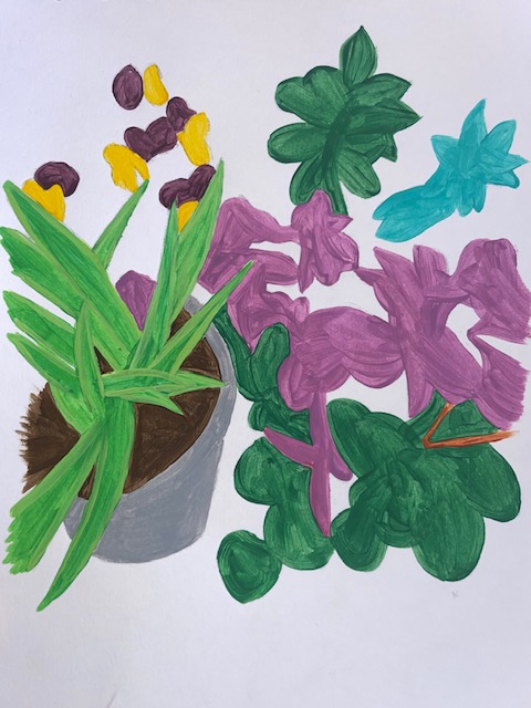
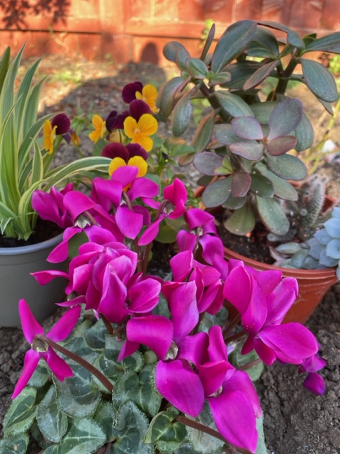
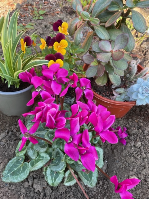
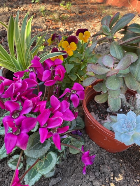
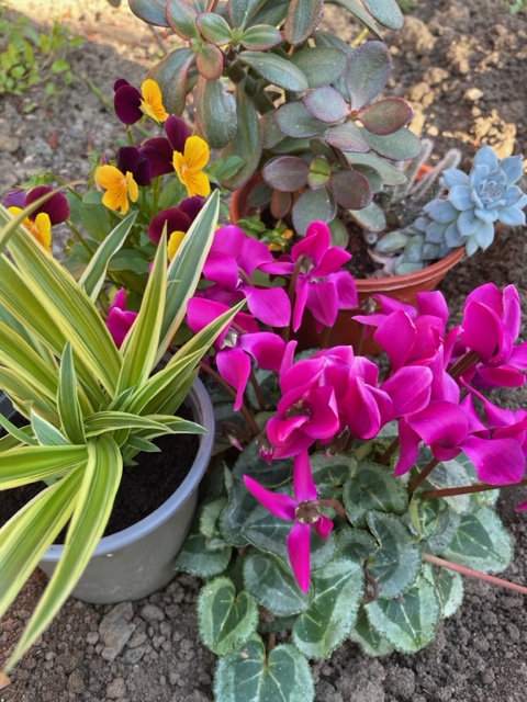
As soon as I read option 3, it was a no brainer for me. I wanted to create something new rather than go back to what I’ve already done. I also love working with flowers because there is a wide range of colours to work from and they’re beautiful to look at. I gathered some plants around my house and took them outside to place with the flowers in my garden. I set the still life up and took photos from different angles to see what worked the best. I had to consider the composition carefully as well as how you can work to capture the colour palette effectively.
Chosen Still Life Composition
Following this, the next task was to create 8 to 10 drawings using any media and in any size I’d like. I started with coloured pens and trying to translate the main features from the still life. I felt like I’ve picked the colours out well.
The next drawing I made was a simple one. I focused on the spider plant and drew a sketch of the leaves. I like this because it is minimal yet you can see clearly what it is.
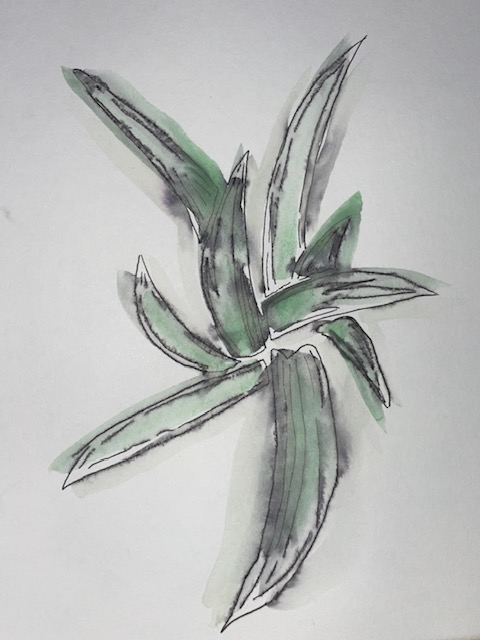
The next drawing I did was focusing on the spider again but this time with pen. I drew with the pen and then decided to go over with watercolour. I mixed dark green with light green and painted over the top but the pen started to run as soon as the water touched it. It was an unexpected surprise but I liked how it turned out.
Carrying on with the watercolour, I wanted to make something that I had more marks to work from as I struggled with that in previous exercises. I painted a light green background with darker green marks on top. I then mixed colours matching the flowers and foliage on the still life image. I made some more marks in the shapes of those flowers and leaves.
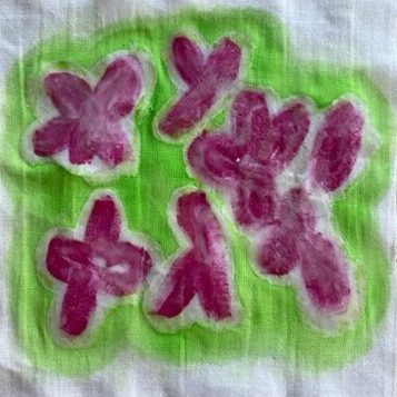
Using watercolour again, I focused on the pink flowers this time. I mixed the paint to match the pink but it was hard to get a hot pink with watercolour. I painted the pink flower petals on first and then went around with a dark green colour. I then added darker green marks around the pink flowers.
Moving onto gouache paint, I wanted to create a pop art style painting relating to the still life. It was even harder to make a hot pink colour with gouache than it was with watercolour so I made the closest colour I could. I just painted block colours of each flower and foliage and the outcome was great.
Using gouache again, I focused on the succulent in the back right corner of the still life. I mixed the main colour which came out really well and then added the pink tips.
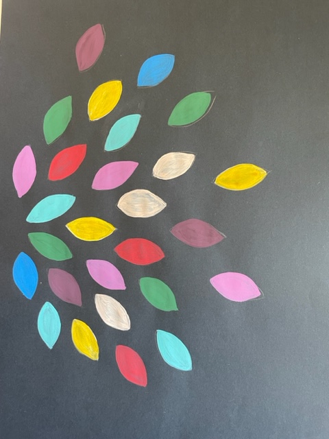
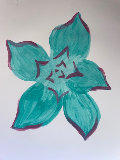
The final drawing I made was a simple petal design. I went a bit mad with the colours but the design turned out exactly how I imagined it.
I really enjoyed this exercise as I explored colour a lot more and I love working with flowers. I feel like I have produced a wide range of drawings and paintings that I can work from.
“The studio is a laboratory, not a factory. An exhibition is the result of your experiments, but the process is never-ending. So an exhibition is not a conclusion.” (Chris Ofili)
I agree with Ofili’s statement because when we’re creating art, it is always about experimenting which is what they do in a laboratory whereas in a factory, everything is manufactured. An exhibition can also be some kind of conclusion if that what the intended purpose was. But more often than not, it’s almost like a pause in the work. Every piece of work leads onto the next.
The brief asks how we would like to conclude or stop at the end of the course. Like I said before, every piece of work leads onto the next. So I’d hope that this course allows or inspires me to carry on with the creativity.
This next part of the course is made up of three projects which link to one another. Assignment 5 then brings all of these projects together to present a coherent and exciting folio of work.
Project 1 requires me to generate new and improved visual work by observing and working with techniques that I’ve already used.
Project 2 will guide me to consider and develop the other ingredients I would need to include if I was to work towards a capsule collection of textiles.
Project 3 directs me to experiment and take risks in my material making, manipulation and stitch translations.
Assignment 5 requires me to evaluate the work from these three projects and develop and refine my experiments towards a capsule collection.
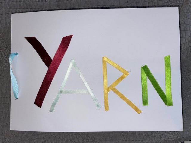
This assignment required me to address the presentation of my work in Projects 1 and 2 as a collection. How I presented this book was entirely my choice. Following on from the previous colour book in Assignment 3, I chose to use the plain white card as the background to give each piece more focus. I had to select the strongest pieces against those that wasn’t as successful.
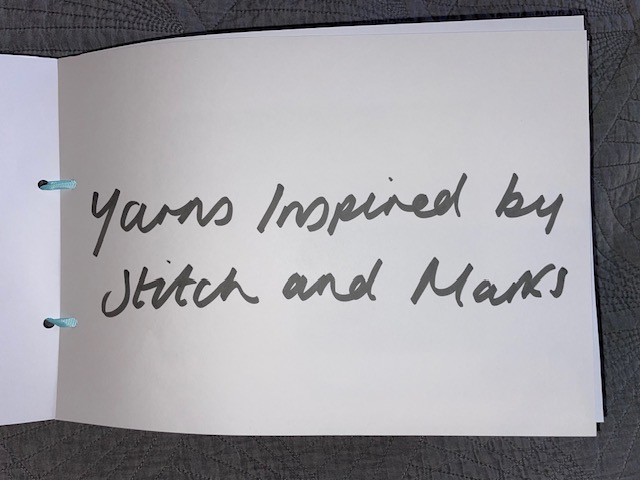
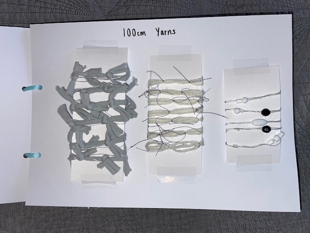
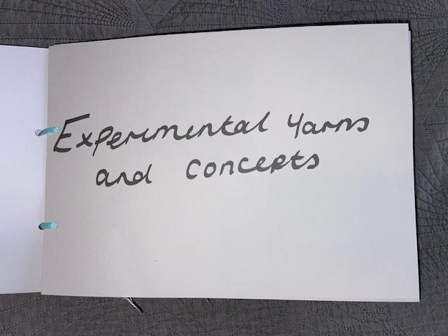
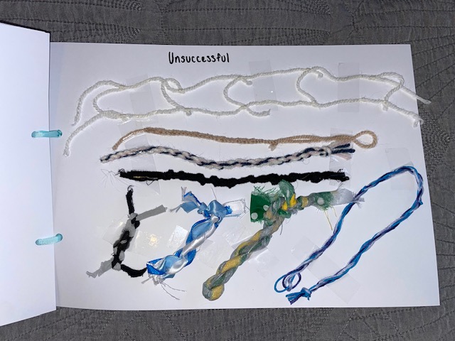
I started grouping the yarns together in order of each exercise and kept the most successful ones. I made a page at the back of the book for the unsuccessful yarns leaving little gap around them as they aren’t the focus of the book. I then had to think about how I was going to attach each yarn to the page. I decided that tape would be the easiest way to attach them. I ravelled up the longer yarns on a strip of card to be able to see them without it looking messy. I then went on to create the title pages for each exercise but I kept the text to a minimum to keep it simple. I made the cover text with ribbon to emphasize the theme. Finally, I tied the book together using yarn to carry on with the theme.
Written Reflection
I enjoyed this part of the course because it allowed me to step out of my comfort zone which is something I have struggled with especially when it comes to creating art. The first exercise was difficult for me because I tried to translate the marks too precisely but coming into the next exercise, there was a lot more prompts which allowed me to loosen up. I enjoyed exploring the materials and colours and combing them all in relation to the task. I sourced all my materials from my Nans as she had a wide variety of them in all colours.
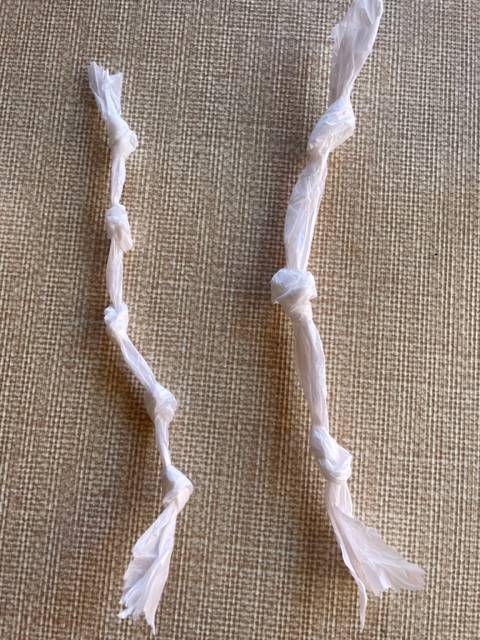
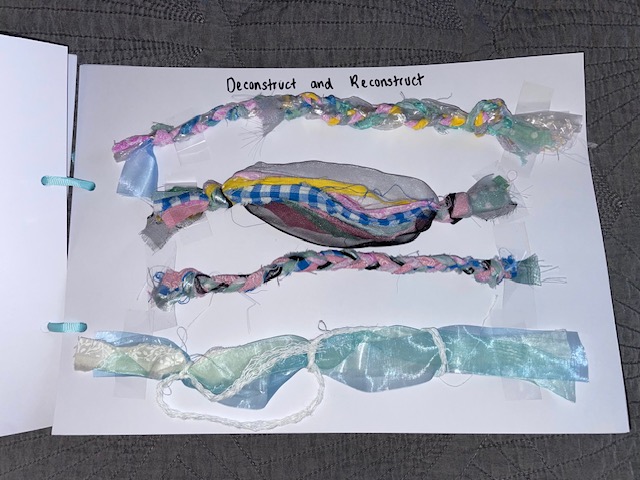
Exercise 4.3 was fun because I learnt a couple of techniques that I will use in future projects such as macramé. Although it was difficult, it is definitely one that I would learn more of in the future. I can use YouTube because there are so many step by step tutorials. Rope-making was another technique I enjoyed learning and will use in the future. Looking back at 4.4, I could have used bleach to change the colours of the fabric but I think using the plastic wallet to translate the transparency was a success.
In Exercise 4.5, I excited to create these yarns knowing I could translate the matte and the grainy surfaces from the collage to the yarn. I could also apply all the knowledge I’d gained from the previous exercises.
Overall, I learned a lot in this part of the course and I hope I can carry on being adventurous and experimental in the future projects.
259 Words
Reflection on Assessment Criteria
Demonstration of Technical and Visual Skills:
I believe my materials and technique have improved a lot in this part of the course. I have gathered a wider variety of materials in a range of different colours. My observational skills have improved and I have applied them to my work especially in exercise 4.5 when translating the surface qualities.
Quality of Outcome:
The presentation of my work has always been clear in my opinion. I add reference photos for everything and I can communicate my ideas thoroughly. Everything I have learned I am able to apply to my work effectively.
Demonstration of Creativity:
I feel like my experimentation has improved massively in this part of the course. I have played around with new materials and experimented with my yarn making.
Context:
Reflection on my work can be critical because I analyse the strengths and weaknesses. I still think I could improve on this more.
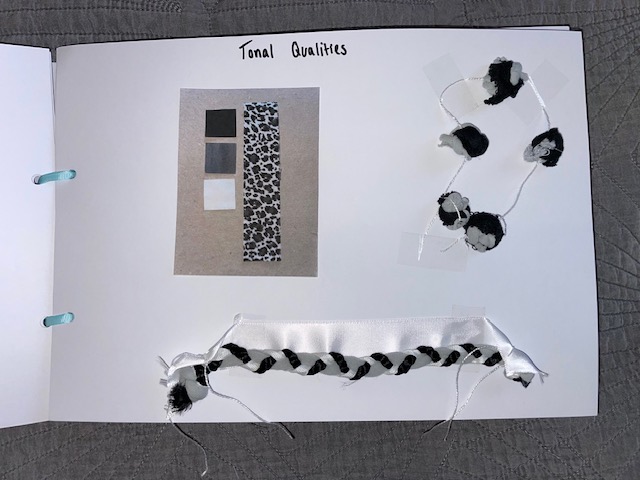
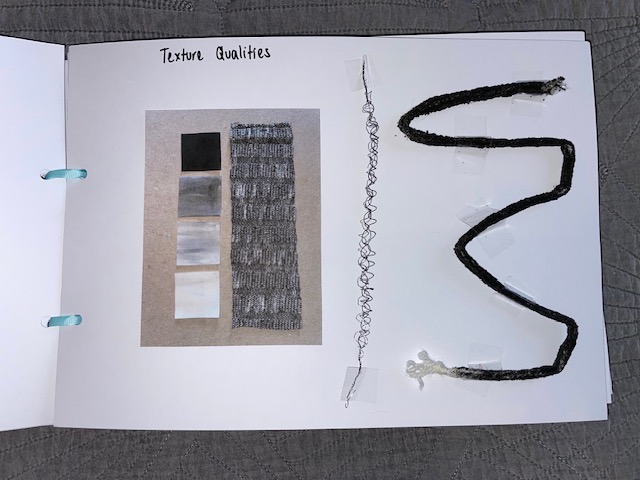
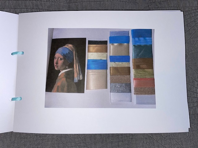
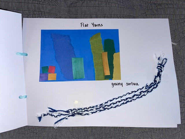
In this final exercise of Part 4, I had to work in a way that echoes the collage techniques I employed in Part 3 using the yarn design concepts but this time the yarns had to be flat. Looking back at collages, I chose two to look at. I tried to translate some of the surface qualities from the paper on the collages so I had to look at them and decide what words would describe it best in order to collect the right materials.
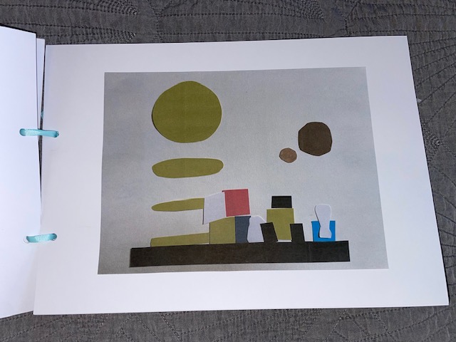
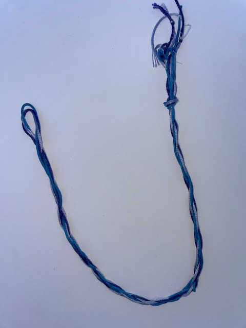
I chose the blue one with ripped paper as the blue paper within this collage has a grainy texture/surface. So the first yarn design I wanted to create was three plaits side by using blue string and white thread. I chose these colours because the blue paper has hints of white on it. I used two lengths of blue and one white as blue was the dominant colour. I then made three plaits and put them next to each other to create a grainy effect. The other yarn I made for this collage was using a two light shades of blue with one dark shade and used the rope-making method again. When it was finished, it also gave off a grainy effect.
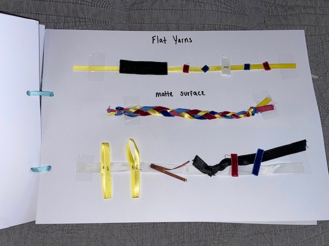
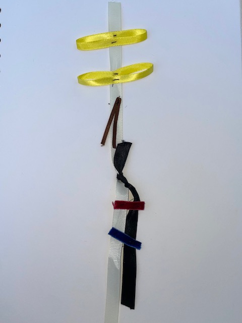
This is the other collage I chose to do. The surface of this collage was matte because of the paper that I used. I found some velvet ribbon which translated the matte effect. As the focus of this exercise was to create flat yarns, I cut small squares of the blue and red velvet ribbon and stitched them onto a length of yellow ribbon. I also added white and a chunk of black ribbon to translate the colours used in the collage. I then did a simple plait for a yarn design using the yellow ribbon and the velvet blue and red. I chose a plait because they end up being flat when finished and I used the colours that stand out the most in the collage.
The final design I did was again using the velvet ribbon. I used the white ribbon as the base because the background of the collage was white. I then create two oval shapes with yellow ribbon to translate the shapes on the collage and then included black and brown with the red and blue.
I am pleased with how the yarns in this exercise turned out and I believe I have done what the brief has asked me to do. I have translated not only the surface of the collages but I have translated the colours and colour proportions in my yarns.