I am very excited to start this part of the course as Photography is a passion of mine. I currently have a Sony DSLR camera and I really enjoy taking photos of almost anything. Photography has been around since 1826 when the first photograph was taken by Joseph Nicéphore Niépce. Camera Obscura is a model dating back to the 4th century in Greece, a device that projects an inverted image of the view through a hole in the wall.
Renaissance
Caravaggio, born September 1571 in Italy, was one of the first people to use the camera obscura. I found an article discussing whether Caravaggio was the first photographer or not.
The Italian artist has long been suspected of turning his studio into a giant camera obscura, punching a hole in the ceiling to help project images on to his canvas. But new research claims that Caravaggio also used chemicals to turn his canvases into primitive photographic film, “burning” images he then sketched on to for works such as St Matthew and the Angel.
Tom Kington, March 11, 2009.
Contemporary
Abelardo Morell, born 1948, is a modern practitioner who also uses camera obscura. He would cover the windows in house with black plastic then cut a small hole in the middle. This allows the inverted view from outside to be projected on the back wall inside. The image below shows his work. You can see the room is obviously some sort of play room or child’s bedroom considering the toys. The view from that bedroom window is clearly projected onto the opposite wall but upside down, which gives you… camera obscura.
Camera Obscura: View in Brady’s Room, 1991
“…photography freed painting from a lot of tiresome chores, starting with family portraits”
Pierre-Auguste Renoir (Coke, 1964, p.66)
Research
The Pencil of Nature
After reading the introductory sections, I think it’s fair to say photography can be both mechanical and creative. Talbot heavily focused on the scientific research that goes into developing photography, trying to figure out the process. A painting usually requires a skilful artist, whereas a photograph necessarily doesn’t. The process itself involves mechanical devices however it is the creative stimulation that triggers it.
Exercise 1
Photography is unique as an art form because it captures the moment. When a fun day out with the family wants to be remembered in the future, you capture the moment by taking a photo. Looking back on old family photos can bring back feelings of nostalgia.
Often the camera can capture what the human eye cannot see. For example, the human eye is able to observe events at fast paces, however, it can’t freeze time or moments. Whereas a camera can, as shown below.
Google Images
A photograph doesn’t necessarily have to exist in a hard copy. In my opinion, whether a photograph exists in a hard copy or digitally on a phone for example, I believe either can bring you the feelings of nostalgia. However, within art, I think it depends on the context. For a photograph to be considered art, I think the best way to do that would be a hard copy.
“The context in which a photograph is seen… [affects] ..the meanings a viewer draws from it”
The definition of cutting edge means the most advanced developments. For example, for every mainstream Facebook, there are dozens of smaller companies testing out new ways to engage an audience online.
Futurefarmers.com is an interesting page about farmers that have created new technology such as “Wind Theater” (2019) and many other designs “for exchange that catalyse moments of ‘not knowing'”. Communiculture is a website that seems basic with the logo as that main screen, however, I cant seem to get passed the login screen. I also couldn’t access Theyrule.net as it was stuck on the loading screen.
I decided to research sites that interact with the viewer. It’s hard to know what to search when looking for these things. I have come across Ono, it is a zero waste and highly personalized meal delivery service that uses your body statistics to personalise your order. The website uses contrasting earthy tones to separate the visuals from the text. It guides the audience through the process of personal health and dietary options to suggest the best food recommendations.
Another example of interactive design is the Nike By You. I remembered I used to design my own trainers on this website when I was younger. You could personalise the colours you like and what styles.
The examples I have found suggest they are messages to persuade or entertain people to draw in more clients or customers.
For this exercise, I was asked to find examples of different visual conventions used to convey time and/or place. I was given the option to explore the OCA online library and use some of the resources on there. I tried to research graphic novels and comics on there but I struggled to find anything.
I researched graphics novels on the normal browser and I found an article that tells us the best comic book artists. There was a few names mentioned such as Marnie Galloway, Craig Thompson and Fiona Staples and many more. They have all won Eisner awards for their work, for example, Craig Thompson won the 2004 Eisner award for Best Graphic Album.
I got thinking and I then researched the Dr Who graphic novels and came across some interesting things. The novel explores the theme of place through multiple frames. We already know that Dr Who teleports to different locations so that challenges the idea of place. We can see here below that he mentions the North Pole. Then below, the doctor gets into the tardis and travels to a new location.
My next mission was to head to the library and try to find some primary sources of graphic novels or comic books. I found a comic book by Herge, it was called ‘The Adventures of Tin Tin: Destination Moon’. The cover instantly caught my eye because the main characters were in a jeep travelling to a rocket. I could assume they’re heading to the moon as the title is a big giveaway and there is a rocket.
The Adventures of Tin Tin: Destination Moon. By Herge. Published March 1950
I have found an example on page 3 that portrays the passing of time through the use of frame by frame squares and this is clearly shown through the narrator’s speech “Two hours earlier…”
p.3 of Destination Moon, By Herge.
Another example on page 4 suggests the place is stated when Tin Tin tells the captain that there is a signboard. In the bottom left frame, it clearly shows they are travelling across a mountainous area. It also portrays the passing of time again in the narrators speech.
p.4 of Destination Moon, by Herge.
I found this exercise very difficult and I struggled to understand it. I have done what I can but I believe I could have broaden my research, however, it was just a challenge for me overall.
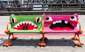
The first thing I research was yarn bombing, even the word sounded cool. Lorna and Jill Watt have yarn-bombed many things in the past but the main one that caught my eye was the Buttmunches. It’s their most recent project that went viral and it is such a creative piece of art.
Knitsforlife.com
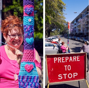
I came across ‘Queen Babs’ also known as Jane, when my mum showed me her artwork on Instagram. She also does yarn bombing, Her work is very colourful street art and she produces this work to “add colour to the city and make people smile”. I believe her work does exactly that. An article on the Daily Telegraph tell us exactly what she does and why. She takes donations from the public which helps fund her wool but she also gives an amount to charity.
Knitted items have become more popular again nowadays such as knitted jumpers. We associate knitted jumpers with winter, mainly known as ‘Jumper Season’.
The last thing I will mention is Sushi Amigurumi. It s a food set by Ami Amour. It really caught my eye as it is unique and different.
Historic Knitting
The next thing I came across was knitted clothing. Clothing was kitted for soldiers in the war to keep them warm. It prevented trench foot which could later lead to death.
I found a piece of artwork by Rowland Wheelwright (1870 – 1955) entitled ‘Irene Knitting In An Easy Chair’. It depicts a lady sitting in a chair knitting in front of an open fire.
Part 3 was definitely a challenge for me as I struggled to understand the subject. Visual communications aren’t necessarily hard to come to terms with because its literally communicating visually. Its when I start to break down an image and look into the deeper meanings, that’s when I found it difficult. I really enjoyed doing the knitting patterns exercise as my nan loves to knit so I got her involved in it with me. She told me everything she knows because I believe she has done it for many years now.
Semiotics was quite difficult for me at first because I couldn’t understand the sign = signifier + signified. I think that because I struggled with this exercise, it put me behind on the other work. It took me a while to figure out but once I got there, it was alright but I just hope I understood it correctly. I also really enjoyed doing the film posters as I am familiar with analysing the details. For GCSE Media, one of our projects was all about analysing film posters and then designing our own poster. I chose to analyse my favourite film ‘Snatch’ because I’ve seen that film more times than I can remember so it was fun to dig deeper.
When I finally got to the assignment, I knew that I wouldn’t be able to complete it in such short time as I was already behind so I got an extension but I think it actually helped more because I completed it better than the others. That’s my opinion anyway. Again, I struggled at first but I came to terms with it pretty quickly. I chose to focus on the Mona Lisa painting and the re-appropriated version of her in Andy Warhol’s piece ‘Thirty Are Better Than One’. Mona Lisa was another piece of art that was first introduced to me in school in GCSE and A-level Art so it was exciting to discuss it again.
Overall, this Part of my course was challenging but I have definitely learnt from it and I will probably consider it more in the future.
In this assignment, I was instructed to identify an example of re-appropriation within visual communications. It could be illustrators or designers drawing from wider visual culture or advertisers using ideas from films. I will look at the original image and complete a semiotic analysis with its contents and possible meanings. The two pieces of work that I will be analyzing are the ‘Mona Lisa’ by Leonardo Da Vinci and ‘Thirty Are Better Than One’ by Andy Warhol.
Firstly, I started with researching re-appropriation. I found a definition that suits it perfectly.
Appropriation in art and art history refers to the practice of artists using pre-existing objects or images in their art with little transformation of the original
As explained in the Tate Modern website Art Terms.
There is a fine line between appropriating and copying, if you copy someone’s work you should give credits where and when it is due to respect the artist. Otherwise, it is classed as plagiarism. Further down on the Tate Art Terms, it mentions a few artists such as Marcel Duchamp with his urinal artwork. He re-appropriated Leonardo Da Vinci’s ‘Mona Lisa’ by drawing a moustache and a goatee on a postcard version of the painting. Jasper Johns (born May 15, 1930) is also mentioned, I further researched him and he has re-appropriated ‘Mona Lisa’ as well. However, his piece ‘The Seasons (Summer)’ features ‘Mona Lisa’ in a different way, she is seen slightly towards the back of his piece. These images have inspired me to use ‘Mona Lisa’ because she is very famous and many artists have re-appropriated Da Vinci’s painting. The painting has been mass reproduced on items such as coffee mugs, postcards, t-shirts and so on. Does this then effect the meaning of the painting? I believe it makes mundane due to easy access, it takes the fun out of not knowing.
I will begin with a semiotic analysis for the original painting. For instance, Da Vinci used oil paint on a wood panel, he used a technique called Sfumato a revolutionary new technique of his time which consists of blending of light and shade. It is a portrait painting of Mona Lisa seated in a chair, her body angled slightly to the left but face and chest turned towards the viewer. Her facial expression is a half-hearted smile and her eyes directly gazing at the audience. As an observer, you might first notice that she has no eyebrows, however, I am unaware if that was intentional or just due to the age of the painting. Her left arm is placed resting on the arm of the chair, her right arm is resting on top of her left arm and she is wearing a dark-coloured dress. She is positioned against a scenic background, the bottom half that is in line with her chest and shoulders is very mountainous scenery with a wooden bridge to one side. Further up, in line with her head and eyes is what seems to be a lake with smoky blue colours.
There are a few possible meanings that this painting has. Firstly, her crossed arms could be suggesting the side of her wanting to protect herself. When people sit or stand with their arms folded, it suggests they are protecting themselves or feel insecure. The next important thing to discuss would be her smile. It is a half-smile with the corners of her mouth raised. A smile is a visual representation of happiness so this could imply that she is content with being painted. Her gaze, on the other hand, is quite mysterious and her eyes follow you wherever you walk which suggests she is watching down on her viewer. The Mona Lisa painting was originally commissioned for Francesco del Giocondo, however, the client never received it as Da Vinci kept it for himself. She was painted in Florence, Italy in the 16th century between 1503 and 1506 and considered the greatest treasure of renaissance art by most people.
Mona Lisa is currently permanently located at the Louvre Museum in France. I accessed the image online at mymodernmet.com, this website had an extremely clear photo of the painting and looking closely it is possible to see the age-related cracks in the wood. Having never seen the original in person due to living in the UK and the artwork is in France, I would like to visit her at some point when I travel through France to Spain. “So it’s finally possible to ask yourself critically: is she worth it?” (Johns, J. 2005) Most people believe it’s not worth traveling to see her unless you’re a big Da Vinci fan or happen to be in Paris.
There are a variety of examples of re-appropriation with Mona Lisa such as Marcel Duchamp’s ‘L.H.O.O.Q’ or Jasper Johns’ ‘The Seasons (Summer)’ but I have chosen to focus on Andy Warhol’s ‘Thirty Are Better Than One’. The title itself ridicules a consumer society that loves quantity over quality. In 1963, whilst successfully touring the United States, the Mona Lisa caught Warhol’s eye and that he was inspired as much by the ubiquitous nature of the image as its historical importance. Warhol was obsessed with the celebrity cult so of course, he had to re-appropriate Mona Lisa. “He proposed that fame was a commodity, and that the endless replication of a celebrity’s face made it so.” (Keats, J. 2013). He produced a series of works in various sizes and colours, all relating to the original painting. The final piece was published on the occasion of the 1997 exhibition “Andy Warhol: Thirty Are Better Than One” at the Tony Shafrazi Gallery, NY.
Figure 1. Leonardo da Vinci (c.1503-06) Mona Lisa
Figure 2. Warhol, A. (1963) Thirty Are Better Than One
I have placed the two next to each other to compare the similarities, differences and discuss how the new references the old. The first comparison to make is obvious, the original has been used but the difference is there is 29 more in Warhol’s version. He referenced the original but just repeated multiple times and made smaller like a grid. Another difference is the colour and medium used; Da Vinci’s is in colour oil paint and Warhol’s is black and white silkscreen. The line, form, and value are all similar as he has taken those elements from the original, however, shape and space have changed because he has repeated the image so shape and space would be larger. The texture of each image is different from one another because of the medium used. All these elements have been used to create meaning, the title is “Thirty Are Better Than One” so that explains the use of repetition.
Andy Warhol embraces mass consumerism and reproduction within his piece, he says ‘More is better’. He challenges the idea of valuing only the original piece. Da Vinci has challenged his viewers with trying to understand the mood behind her smile. Andy Warhol was inspired and followed in Duchamp’s footsteps after he drew the moustache and goatee on Mona.
I was asked to examine a location in a movie and how that environment may be perceived differently. On page 34 of Place – Room One: Urban, it talks about how a certain location can be recognised as scenes from a film setting. Everything is perceived differently by different people. It depends on the way your brain works. On page 35, Liam Gillick talks about Stanley Kubrick’s film “A CLOCKWORK ORANGE”. He says “Kubrick was concerned that the vision of Britain portrayed in the film would encourage violence and social unrest.” You could say this about most crime films that are seen on TV or Netflix such as Brotherhood. A better example would be the new film that has recently been released called “Blue Story”. It all about gang war and fighting for postcodes in London. Obviously if you haven’t seen the film then you won’t recognise the area from that. So I do believe that locations can be perceived differently in different context.
This is a scene from the Blue Story film, which was based in Peckham.
In this final project, I will be looking at ideas of how past, present and future designs interact with one another. Most of us nowadays are familiar with social media and that Facebook and Twitter are widely used all around the world, yet the idea of computer technology is still relatively new. A website can appear new through aesthetic changes, so a website can be edited to look modernised through new technology.
I’m not sure if my example is a visual communication or not but it’s definitely contemporary. Below, is an advert for the new iPhone 11 Pro. It is the first iPhone to be called Pro with the fastest chip. The advert consistently projects what technology they have used to create this futuristic phone. It shows hydraulic arms lifting and placing pieces together, drilling perfect holes and testing with proper machinery. There is a room full of computer cables, devices and motherboards. It also shows the long battery life with scenes of children playing videogames which also entices the younger generation as they feel they can relate to them. The overall advert emphasizes all the new features that come with this iPhone. The quote that stands out at the end of the video is “pushed to the extreme”.
I’d say this is characterised as new; the main one being the release date which is 20 September 2019. Then of course, the finishing look of the iPhone makes it look new with the technical design and 3 in 1 camera. It fits in with other contemporary trends such as Samsung as the two are almost competing, making sure they have the latest trends first. Every year Apple release bigger and better iPhones and every year, the previous one becomes ‘old’. So eventually, this new iPhone 11 Pro will become “last year’s thing” and the iPhone 12 will replace it.
Richard Fayerweather Babcock, Join the Army c.1917 (colour litho), Bridgeman Images
Denotation – What Can You See?
A portrait poster.
The bottom third is text.
“JOIN THE NAVY” is portrayed in bold red font.
“THE” is a smaller size underlined by waves.
Underneath, in a smaller blue font and capitals, read “THE SERVICE FOR”
Below that, continues the message with “FIGHTING MEN” in a slightly larger blue text, also in capitals.
The blue text is underlined with a yellow/gold colour which corresponds with the missile.
The top two thirds are an image.
A man wearing blue overalls and a white hat.
He is saddled on a yellow/gold missile.
Holding on via a thin rein with his left arm.
His right arm is raised, holding some sort of whip.
Appears to be gliding across water.
Water splashing up at him.
Connotation – Implied Meaning
The portrait orientation and the juxtaposition of the image and text aims to catch the audiences attention, encouraging them to join the navy.
The poster aims more towards male population, back in those times the women were stereotypically meant to stay home and the men would go out and work. The poster draws in young, strong, dominant males.
The missiles positioning signifies masculinity and the exaggerated phallic symbol.
The way he is ‘controlling’ the missile connotes horse riding/racing. A sport that was widely popular for men, however, in recent years, more women have been competing.
The gold colours of the missile suggest wealth.
The red text could connote a lot of things. It could connote love and passion for the brothers in the navy. However, it could also connote violence, blood and danger that come with fighting.
The blue text is specifically aimed at men. The colour blue is stereotypically associated with masculinity. The use of navy blue is associated with power and professionalism and emphasizes the Navy.
Analysing a different image:
Denotation:
Portrait poster.
Two thirds of the poster is black.
The bottom third is water.
Grey water bottles acting as rain.
Landing in plastic infested waters.
Red sea life floating on the top, dead.
Big bold text at the top in a light blue reads, “71% of the world IS UNDER ATTACK”
The word “ATTACK” is in white and slightly larger.
Below that, another piece of text but not in capitals “One hundred thousand marine mammals and sea turtles are killed each year by ingestion of plastic” again, the word “killed” is in a different colour.
Near the bottom, in bold capital letters it reads “DO YOUR PART” in light blue colour.
Below that, It reads “RECYCLE” in bold, white writing.
Connotation
The poster is intended to show you the effects of plastic waste and the impact it has on the environment. It implies that with the increased amount of plastic being used, it may as well be falling from the sky.
It encourages people to “do your part” and recycle.
I wasn’t sure where to start with this exercise so I just researched the apple in art history. The first thing I thought of was Adam and Eve from the Garden of Eden. The fruit was eaten by Eve from tree of knowledge of good and evil. But it’s said that the piece of fruit wasn’t described as an apple in the Book of Genisis, it was added to the story by artists. In the image below, the ‘signifier’ is the forbidden fruit (apple) and the ‘signified’ is Eve’s disobedience to God.
There are many different paintings of Adam and Eve and each depict a different meaning. When Eve is taking the forbidden fruit, it’s signified as a sin whereas when Adam has the apple, it is signified as the fall of man.
The Fall of Man by Peter Paul Rubens, 1628-29
This then leads me to the Golden Apple that appears in Greek mythology. The golden apple was planted and The Hesperides tended to the growth resulting in The Garden of the Hesperides. The apples are known to give immortality to anyone who eats them, but the gods and goddesses are already immortal. So Athena, Aphrodite, and Hera fought over the title of Fairest. However, the apple’s beauty was a trigger for the Trojan War.
Apple of Discord
Frederic Leighton – The Garden of the Hesperides (1830 – 1896). Oil on canvas.
A more modern example; I also thought of the use of the apple in Snow White. It is a childhood film of mine and I remember the princess being given a poisoned apple. It is a magic blood-red apple which, when eaten sends the victim into a sleeping death. The apple in this story signified death.
Snow White and the Seven Dwarfs, 1937
This saying still floats about today in modern times. It is a reference to Greek mythology meaning immortality. The modern term is signified as healthy living.
When you see an apple tree, it is signified to nature. But when you see apples in a supermarket, it is signified commercial food.
Apple TreeApples in Supermarkets
When you hear the word apple, most people assume you’re talking about the phone company. Since 1976, Apple has been hugely increasing in popularity. It is a multinational technology company, most people would know them for their iPhones, MacBook’s and many more devices. Their logo is an apple. Back in 1976, the logo was designed by Ronald Wayne; the third co-founder. I believe it depicts Isaac Newton sitting under an apple tree, one specifically above his head. As time has passed on, the logo has become more modern and re-designed by graphic designer Rob Janoff. It went on to be one of the most iconic logos in history. The bite is to emphasize the representation of an apple, it is also referred to as a computer ‘byte’.
After 22 years, the colours were then replaced with a more modern look. Which continues to be the same logo to this day, taking on all sizes and colours. The shape, however, stays the same from the original in 1976.
Apples have been grown for thousands of years. It is one of the most popular fruits but in recent times, the apple has become more significant in almost everything. From historic paintings to the science behind it, from nature, love and knowledge to a computer brand and everything in between.