In this project, I had to think about all the ingredients and tools needed to build towards textile experimentation. I had to make selections and observations that would directly inform the work in Project 3.
Identify and Present your Colour Palette
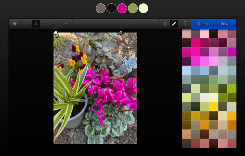
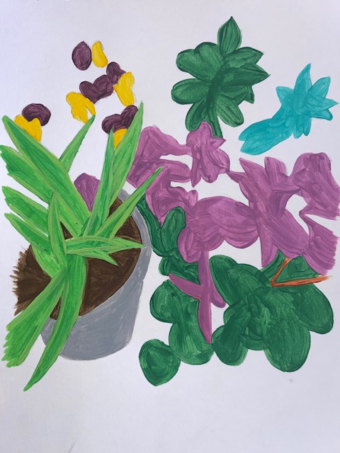
Working from the drawings in Project 1, I had to paint out some colour chips to extract the colour from one or more of the drawings. I thought ahead when doing my paintings and painted colour chips as I went along so I didn’t have to try and mix it again. I made the squares 3cm by 3cm because it shows enough of the colour. I also decided to use ColRD again with the still life photo to extract a full colour palette.

Be Inspired by an Artist or Designer
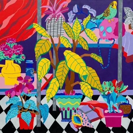
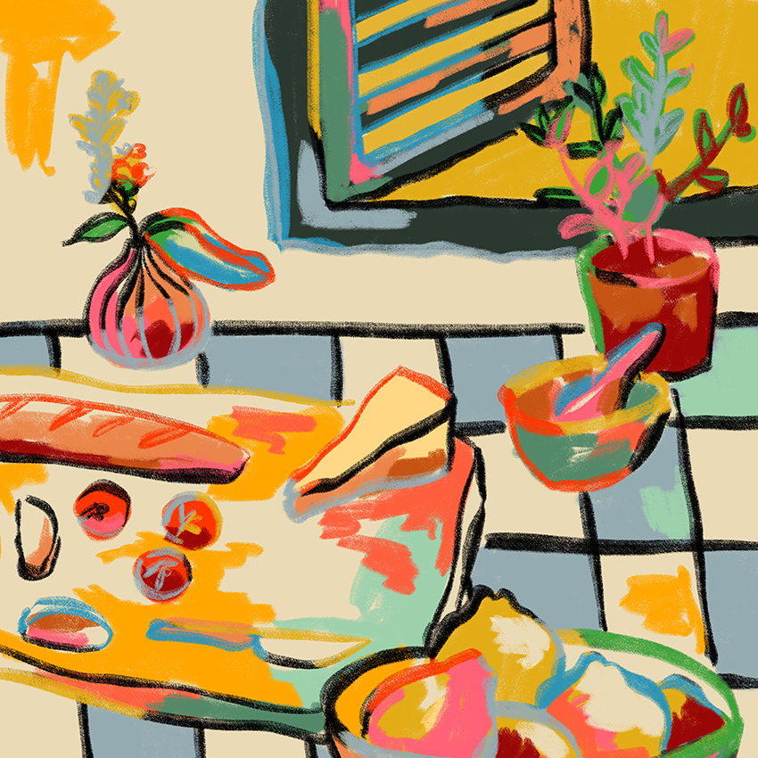
In this section, I had to find at least one artist whose work and use of colour was inspiring to me. I started by researching artists with floral still life paintings. The first piece of work that caught my eye was Florent Stosskopf‘s Still Life With Bird And Shell made in 2020. The bright and bold colours are what drew me in because I had just used bright and bold colours in my painting. Stosskopf is a self-taught painter from Brittany, France. His work is a mix of traditional themes and archetypes through a contemporary perspective. Using vibrant saturated colours, he removes the shadows to emphasize both the style and disconnect from reality translating the three dimensional objects to block colours and flat lines. Flower Shelf was another design that caught my eye with the playful vases and vibrant blooms.
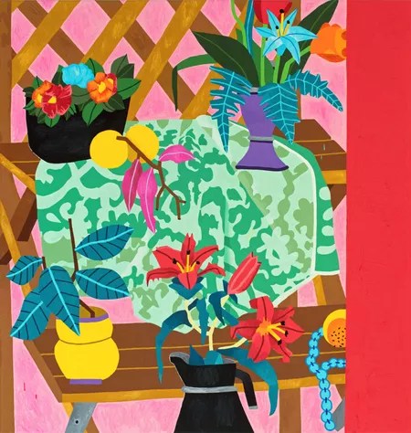
Another artist whose work caught my eye was Sandra Poliakov. Specifically, Bread and Pasta Love and Wine Break. She also uses bright, vibrant colours in her paintings. Her still life portraits contain daydreams of outdoor picnics, long lunches and sun-filled days. Sandra tells Wrap Magazine “I notice the harmonies of colour in my everyday life. I like to express this in my work by combining colours which, according to ‘rules’, dont necessarily go together”.
ColRD. At: http://colrd.com/create/image-dna/ [accessed 04/09/2023]
Florent Stosskopf: Eternal Flowers, Beers London. At: https://beerslondon.com/exhibitions/forthcoming-florent-stosskopf-eternal-flowers/ [accessed 04/09/2023]
Gomez-Upegui, S. July 7, 2021. 10 Contemporary Artists Taking Fresh Approaches to Flowers. At: https://www.artsy.net/article/artsy-editorial-10-contemporary-artists-fresh-approaches-flowers
Valentine, H. March 11, 2021. Sandra Poliakov’s Vibrant Expressions of Everyday Joy. At: https://www.wrapmagazine.com/editorial/a-life-lived-in-colour [accessed 04/09/2023]
Develop Textile Concepts
Using the drawings from Project 1 as my source of inspiration, this section required me to develop a series of textile concepts using papers. In Part 2: Surface and Stitch, we were given a list of words that describe the treatments that can be applied to paper. The list of treatments I used were as follows:
- Layering
- Cutting
- Folding
- Tying
- Tearing
- Crumpling
- Twisting
- Burning
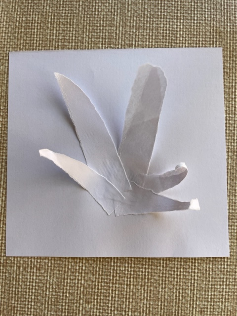
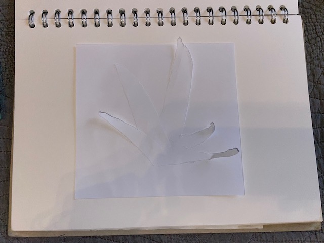
The first concept I made had the spider plant as the focus. I tore some strips of paper that went into a point. I then stuck them onto another piece of paper. I only glued the bottom of the strips to allow the tops to flow giving it a three dimensional effect.

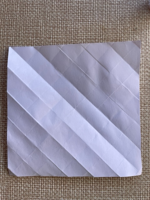
This technique involved me folding the paper in a diagonal way to relate to the diagonal marks on my painting.
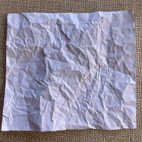
The next technique I used was crumpling. I thought this one would be good to translate the finer marks in the original photo source.
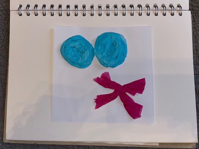
I wanted to make some three dimensional flowers so for this technique, I used coloured tissue paper to translate the colour from the plants. I rolled up the blue tissue paper, squashed them and then stuck them to the white paper. I folded strips of pink tissue paper and stuck them together to translate the pink flowers.

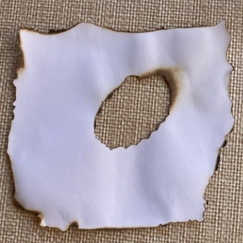
This technique was an experiment that I haven’t done in a long time. The last time I burnt paper, I was making treasure maps. I burnt the edges and then burned a hole in the middle. It was a little worrying at first as I didn’t want to set fire to anything around me but it came out good.
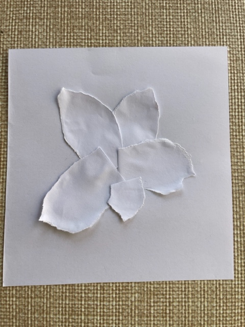
The next technique was another tearing piece. I tore pieces of paper into the shape of the succulent leaves and stuck them to the paper.

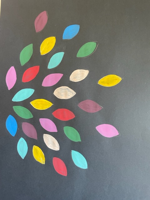
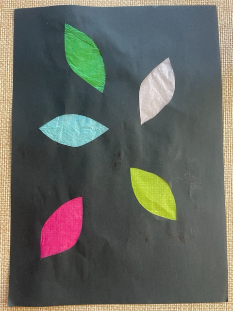
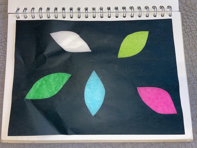
I used the cutting technique for this piece. I cut multiple leaf shapes into black paper and then stuck coloured tissue paper onto the back. I was more accurate with the colours this time compared to the painting.
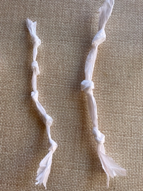
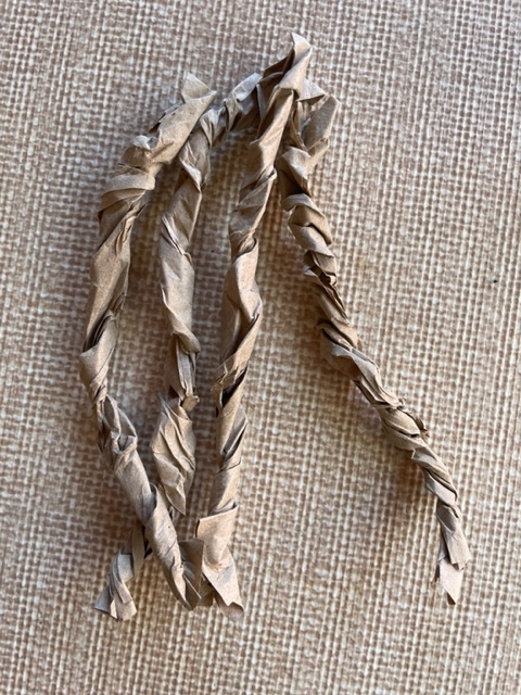
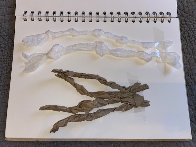
These two techniques are twisting and tying. For the tying, I made two. One with tighter knots and the other not so tight together. The other technique, I twisted brown paper up and made 4 strips.
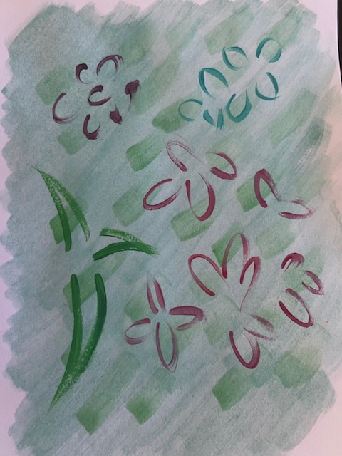
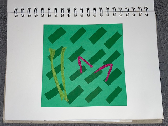
This is another cutting technique. I used coloured paper and tissue paper to translate the marks in the painting.

Develop Yarn and Linear Concepts
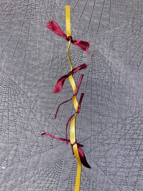
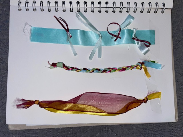
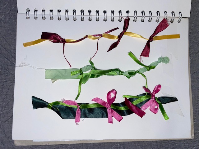
In Part 4 of the course, I explored many options for yarn development which I then employed in this part. I learned a lot when making the yarns in previous exercises so this section came rather easily to me. The first one I made focused on the yellow and burgundy flowers in the original source. I used the yellow ribbon as the base and tied the burgundy to it in a repeat.
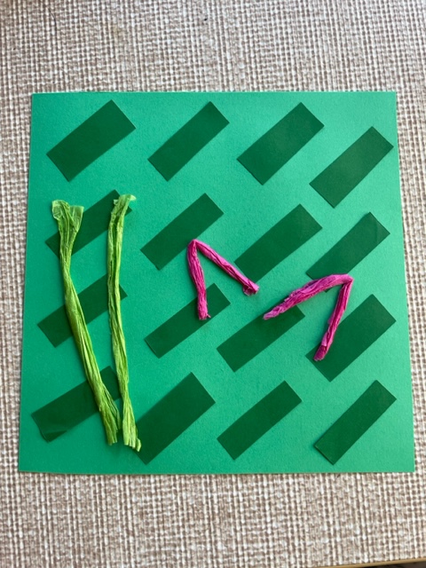
This yarn concept focused on the spider plant. I used a light green ribbon for the base and tied a darker green ribbon to it varying in sizes. I left them to hang to translate the spider plant leaves.

This yarn focuses on the succulent. I used a wide light blue ribbon for the base. I made loops in another lighter coloured ribbon and attached the burgundy loops to them to translate the tips of the succulent.

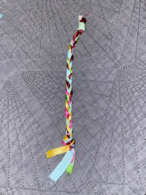
This yarn translates the colours from the whole image. I used 6 different colours and plaited them together.
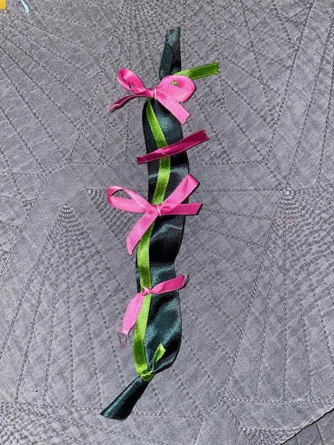
This yarn focused on the pink flowers. I used a dark green ribbon with a light green laid on top to translate the colours at the bottom of the flowers. I then attached pink bows to represent the shapes and colours of the flowers.
This yarn translates the yellow and burgundy flowers again but this time, the ribbon is side by side. You can see in the original photo that the yellow and burgundy flowers are side by side so I chose these two to translate it.

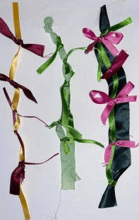
These three images below are important side by side because not only do they evidence the connections between my drawing, use of colour and yarn making, they also show the links between my research and design journey.
Produce a Workbook
This section required me to produce a sketchbook or workbook dedicated to the work created in this project. I used an A4 sized workbook to present my work. I was already using a sketchbook for my work so I continued o use this to present my work. I stuck everything down with glue other than the twisted/knotted paper and the yarn design which I stuck down with Sellotape. The first 5 paper sample aren’t very clear because it was plain white paper, but you can see where I introduced colour and experimented more.


This was a fun project to do because I liked that I made a series of work and you can clearly see the links between them all.
